Whether creating a default homepage or homepages for Team and Content areas, most of us will have struggled with setting them up at some point. If you are about to launch then you are probably trying to decide what to add and how to get them looking as good as they can be.
It’s important to know that there is no secret to building the perfect homepage. Each intranet will have different objectives, so there is not a one size fits all homepage layout that we can all apply to our intranets.
There are, however, a series of top tips that I am going to share with you that will help you build great homepages for YOUR intranet. I’ll also share some common mistakes people make and the things to avoid, whatever stage you are at with your project.
So, what should a homepage be? What should it do?
- It should support your strategy and be in line with your aims and objectives
- It should be dynamic and be driven by the content being added to your site
- It should be tailored to your organisation and fit in with its culture
- It should be built for your audience and targeted to their needs
Improving communications
If one of your objectives is to improve communications and knowledge management then you might think of ways to use your homepage to show news and find different ways that your homepage can promote knowledge sharing.
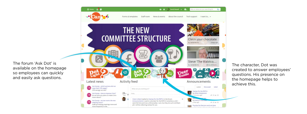
Canterbury City Council (CCC) has achieved this using iCan and their mascot, Dot. CCC wanted to promote him as a friendly, knowledgeable character, there to help and answer employees’ questions. Having him feature prominently on the homepage enabled them to do this and make Dot a part of the culture.
There is a Q&A forum on iCan called ‘Ask Dot’ available on the homepage where members of staff go to ask questions. So far the forum has had 33 threads created, and Dot has answered each question within an hour of it being asked.
Reducing email
If one of your objectives is to reduce email then a forum buried away in a distant team area is not going to be helpful. Use your homepage to advertise this.
Oxford Innovation brilliantly advertise online guru, Ask Anna on their homepage encouraging all questions to be directed onto the site. It’s a fun and easy way to direct staff to the answer they need.
Static becomes out of date and a chore to manage
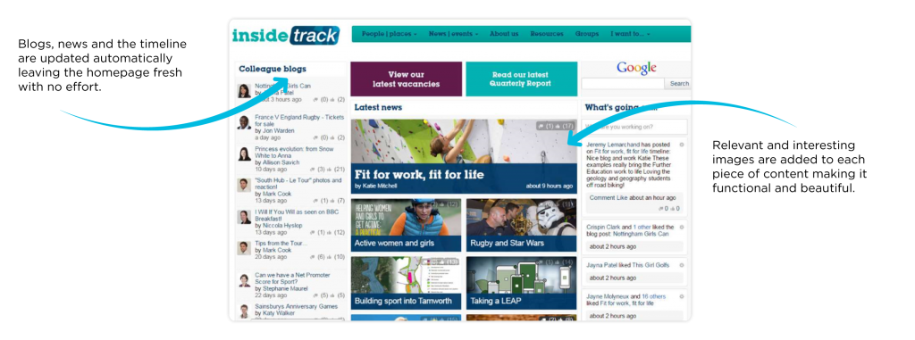
Your homepage needs to reflect the activities of the site. It should tell all the stories for you with no effort involved.
Sport England manage this very well with a combination of blogs, new stories and the timeline, all of which are updated automatically leaving the homepage fresh and new every time it is viewed with no effort required.
Relevant and interesting images are added to each piece of content make it both functional and beautiful, which is something that any organisation can achieve.
If the weather and share price are of vital importance to what you do as a business then they deserve a valuable spot on your homepage. If they don’t then they shouldn’t be there. They are most likely annoying your users and are certainly not bringing any value. Space is being taken that could be displaying valuable information.
What is culturally appropriate for your organisation?
- What messages are you trying to get out?
- What do you want people to do?
- What are the main areas of your site?
- Where do you want to send people to?
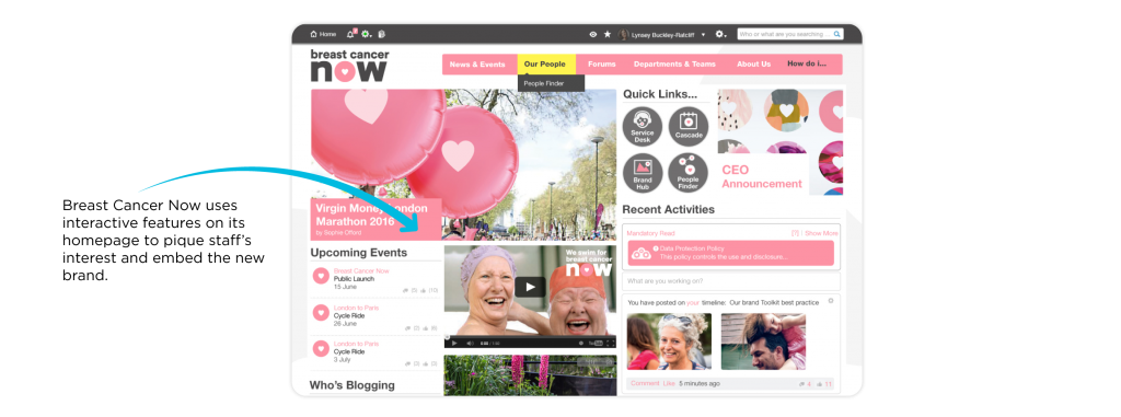
After a merger, Breast Cancer Now had the task of bringing together two sets of staff from two separate companies into one new charity. The intranet had a lot to live up to.
In anticipation of the launch, the homepage was filled with interactive features such as video content, new imagery and branding, blogs, the twitter feed and a ‘what’s going on’ timeline to pique staff’s interest and get them immersed into the new brand from day one.
Ask your audience
When you consider your workforce you will most likely have several different audiences to cater for, such as office-based workers, homeworkers, mobile workers etc. Consider what works for them and what they need to make their job easier. If you are redesigning your homepage, ask them what isn’t working.
By surveying your audience you will be able to deliver a solution that works for them. Not a homepage they immediately close as soon as they open.
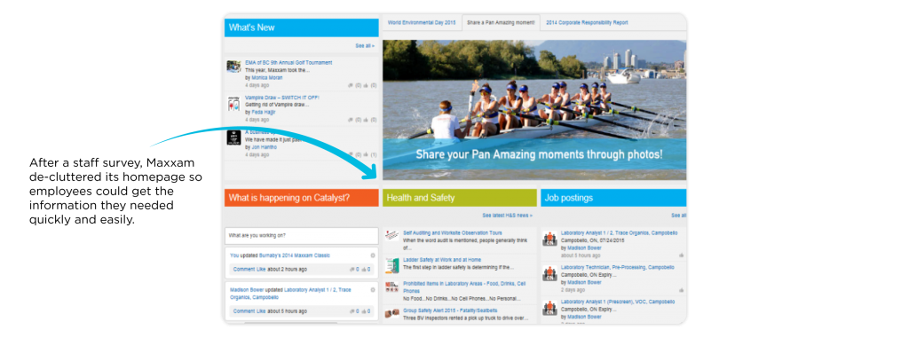
Maxxam Analytics did just this with Catalyst. Based on the feedback received from the 6 month post-launch survey, it became apparent that the homepage was an area on the intranet that needed to be de-cluttered and improved upon. So a relaunch was carried out.
In terms of the homepages on your Content and Team area, consider who they are for. Chances are if they are for the department/team that will be using it they will already know what they do, so there is no need to include a big introduction to the page.
Increasing collaboration
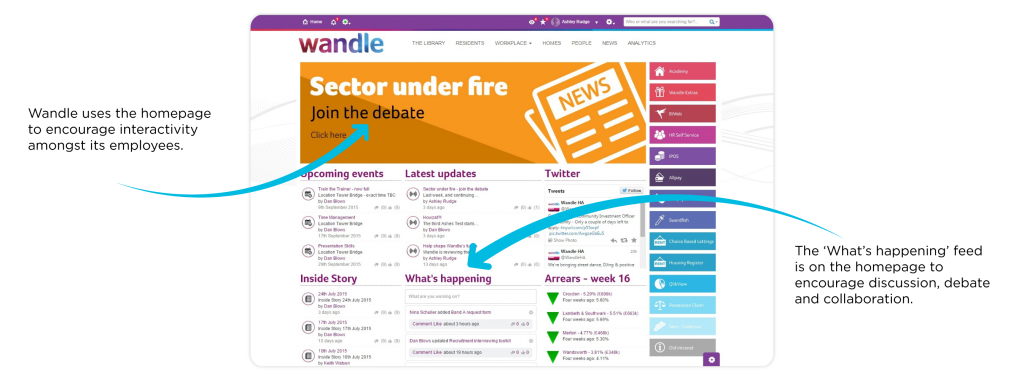
Housing association, Wandle’s main focus was to provide an easy avenue for staff to report any problems and resolve them in a timely way. They wanted interactivity, so the ‘What’s happening’ feed is prominently placed on the homepage to encourage discussion, debate and collaboration.
As I stated earlier there is no exact science or magic formula to making great homepages. It’s about making the most of the tools available to you, and with careful thought and planning you can turn that long list of widgets into something that works for you.
There are however a few things to avoid, and most of us will be guilty of 1 or 2 of these:
- Making it too busy. Trying to add too much doesn’t work, it will just make your homepage look cluttered. You are better to regularly review and refresh rather than adding everything at once.
- Adding tons of text. People don’t read it and it isn’t searchable. Consider how you are getting messages out and use a searchable blog or forum instead.
- Embedding content that will slow the site down or that users don’t have access to. Twitter or YouTube content can be an amazing way to convey information, but not if the sites are blocked. Consider your employees’ access and location.
- Creating ‘welcome’ pages on every homepage. If this is really necessary then use the in-built ‘Meet the Team’ widget to at least make it dynamic, or have a page of @mentions directing you to employees’ profiles.
