Re-prioritise your intranet’s home page
Prime real estate, is how we describe the intranet’s home page, isn’t it? We’re careful what goes on it, although over the years perhaps it has bloated to include too many links and ‘must have’ widgets solely to satisfy stakeholders, rather than the audience.
So how often do you review your home page and assess its impact and value?
Too many companies wait years to ‘redesign the intranet’ and consider it a major project, which it is. But immediate benefits can be realised by implementing small improvements every quarter. A new intranet is like a pair of new shoes; it may not fit perfectly for everyone in the first couple of weeks, but over time it becomes comfortable and relied upon. But over a longer time it can develop into a bit of a mess, and just like shoes that are worn down, it can feel awkward to get around.
Deciding to review your intranet home page every quarter means setting aside just a little time to assess the layout and content against the objectives of the intranet. Sometimes you’ll want to add links, navigation aids, campaign banners and dynamic widgets, but often removing features can help clarify the very purpose of the home page and the intranet.
If you have a fairly static or content heavy home page, perhaps rigid and difficult to amend, then concentrate on how you’re using it. Look at improving the brevity and ‘information density’ of your headings and summaries. Challenge yourself to make sure thumbnail images are against every news story.
Review the footer – are you even using a footer? What non-crucial links might people appreciate always having quick access to?
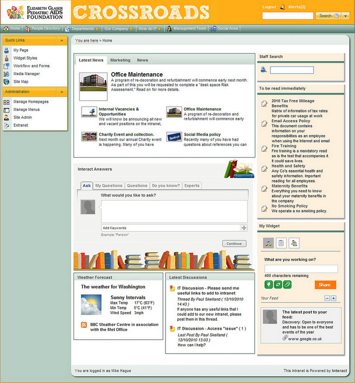
If you have a modular or widget based intranet, then you have more flexibility and ability to change the home page on a whim. So take a little time to assess each widget (and its placement on the home page) so that each one ‘earns its keep’. Sometimes you’ll put new widgets on the home page to help increase adoption of a new feature or service. Other widgets are on the front page because your people demand them! Popularity and usage may well be your guide, but of course business needs must also direct the shape and purpose of the intranet.
Try reviewing the list of available widgets with non-expert intranet users so you can see the benefits of widgets through fresh eyes.
Keep in mind that the top-left (of the content area) of your home page may well be reserved for company news – that’s because in most cultures our eyes travel from left to right owing to how we read. Items on the right-hand column might well provide less urgent communications or services, like collaborative or social business widgets.
No, not every company is comfortable showcasing ‘user generated content’ directly on the home page, but people like to see people, so consider widgets that auto-update with questions, documents, blogs and updates from people around the business. You could always explain it’s a three month experiment.
An example of Elizabeth Glaser Pediatric Aids Foundation’s Intranet Home Page (with demonstration text)
If you want to lead your intranet rather than just be a caretaker, changing the home page demonstrates your commitment to continuous improvements. Be sure to test new ideas with a few dozen people, so that you can keep the intranet ‘people centred’.
For more intranet home page designs visit our Flickr page
Request a personal tour of Interact Intranet
Follow Wedge and InteractExperts on Twitter.

