5 steps to the perfect intranet homepage design
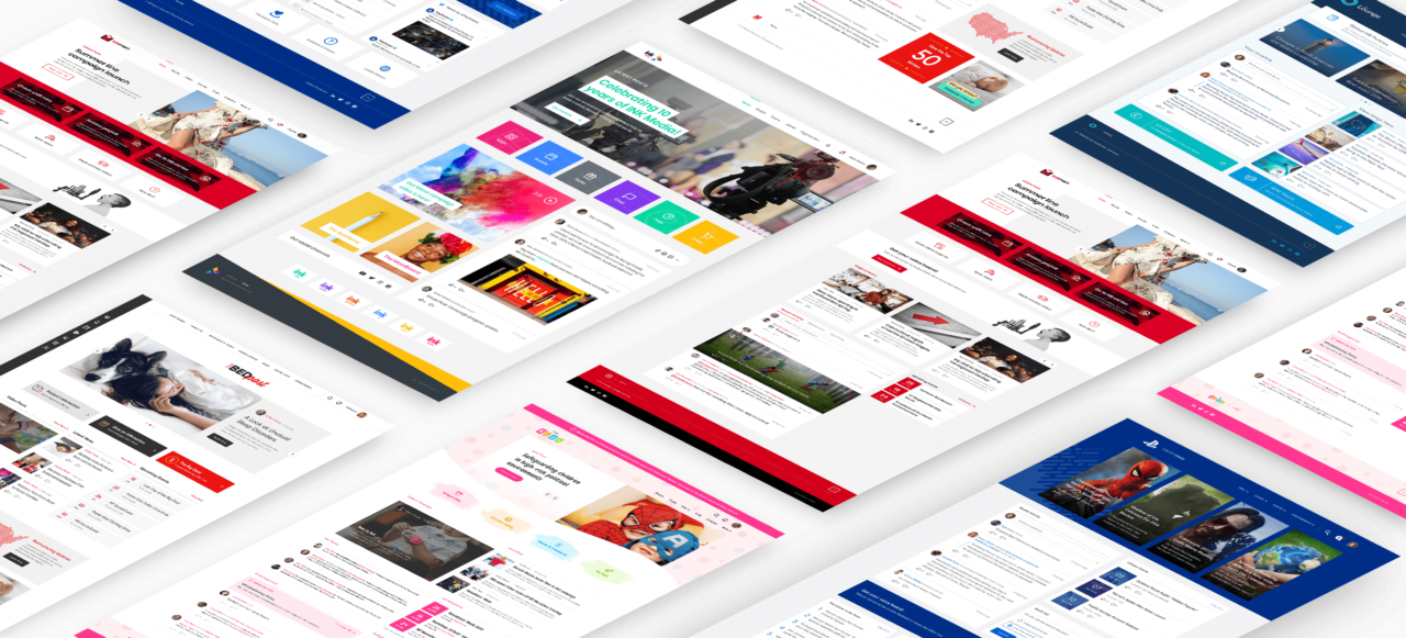
What does it take to create the perfect intranet homepage design? We break it down into 5 simple steps that will take your homepage from dry and drab, to spectacular.
The words, ‘intranet homepage design’ probably don’t inspire much excitement. After all, an intranet is an information tool, a corporate comms platform, the digital HR policy graveyard – right?
Design is often an afterthought during an intranet project. It’s not hard to see why. When making the decision to invest in an intranet, we’re looking for a business return: and as such, looks are often passed over in favor of functionality.
BUT. Design is the core element of an intranet that draws our users in. A great design will capture their attention, point them in the right direction, engage them and give us those all-important returns.
As consumers, we almost instinctively understand the value offered by great design: whether that’s of our cellphones and games consoles, or the websites they’re sold on. It’s time to adopt the same ethos and understanding when it comes to the digital employee experience.
So, where do you start?
Intranet Design Guide
The heart of your intranet: your homepage
The intranet homepage is often first to fall foul of poor design. In the battle of competing objectives, priorities and opinions, everything becomes front-page news.
The result is something we see time and again: overcrowded, busy, text-heavy and an immediate turn off for every user. Close window, done.
Given today’s shortening attention spans and the sheer volume of knowledge and information residing in any given organization, it’s understandable. Your homepage is the most valuable bit of real estate on the whole intranet and when everyone is looking to get their voice heard, they’re going to be bidding for a house in that neighborhood.
It’s time to take a fresh approach and shift our thinking.
An intranet homepage should be the landing point, the gateway or the door into your digital workplace. A springboard, if you like.
Yes, it needs to have that ‘certain something’ that will pull users in; it needs to be dynamic, so there’s a reason to keep coming back. But once your users have landed, it should then direct and guide them seamlessly on the journey to where they need to go.
If your intranet homepage design is leaving you and your users uninspired – or if you’re about to undertake your first-ever intranet project – you’ll see optimal returns and engagement by following the five simple steps below.
How to design an intranet homepage:
#1. Start with the ‘WHY’
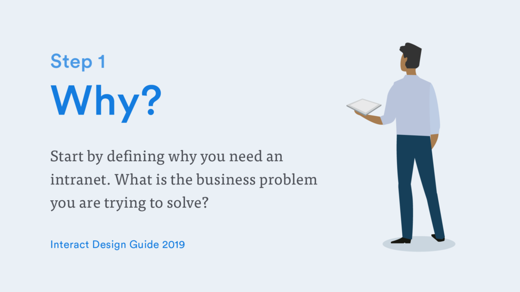
Design doesn’t begin with look and feel: it begins with the purpose.
Understanding the ‘why’ driving your project, and the business challenges you’re trying to solve, will ensure your intranet not only looks great but also serves a functional purpose within your business.
Design for design’s sake doesn’t work. If something looks visually appealing but delivers no value to the user, it will quickly become obsolete. So, to identify your purpose you need to:
- Identify business challenges or objectives an intranet could support
- Evaluate existing tools
- Research pain-points of different departments, individuals, communities
- Prioritize needs or objectives
- Create an opportunity statement
When you come to design an intranet homepage, keeping that purpose front-of-mind will ensure you’re prioritizing the right content, widgets, and elements on that all-important frontpage real estate. If it isn’t answering one of those top-level objectives, it can reside elsewhere.
Intranet Design Guide
Intranet homepage design example: NSPCC
Non-profit NSPCC set this opportunity statement for their intranet project:
The key objectives of the project are to replace the existing intranet with a new one which:
- Promotes organizational culture and reflects ‘one’ NSPCC
- Enables staff to share stories, inspires and engages staff, celebrates success and demonstrates impact
- Encourages and facilitates learning, communications and collaboration
- Builds organizational knowledge
- Helps staff to do their jobs
- Improves business efficiency
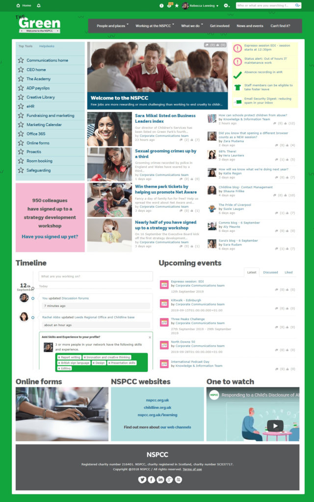
When it came to translating those objectives into their intranet design ideas, the NSPCC opted for:
- Prominent use of new content widgets to share stories, celebrate success, and inspire staff
- Quicklinks to top tools, helping staff to do their jobs and be more efficient
- Visual campaign spotlights to facilitate learning
- Great and consistent use of branding, aligned to the external brand, to promote its organizational culture and mission
Step 2: WHO will use our intranet?
Great design is all about your users. They’re the ones engaging with it on a day-to-day basis: they’re also, therefore, the best judges and informants when it comes to design.
So, ask them.
To get under the skin of your users and ensure your intranet homepage design will meet their needs, you’ll need to:
- Identify user communities and their needs or requirements
- Define your audience and create personas
- Consider different abilities and accessibility issues
- Determine how to personalize and tailor content
When it comes to your intranet homepage design, using intelligent widgets – which can push relevant, timely and engaging content to the right people, at the right time – is an invaluable tool.
Think about your Facebook newsfeed, your Amazon account. Each pushes content to you based on your demographic, previous interactions and more. Your intranet can – and should – do the same, personalizing and tailoring the intranet experience.
Intranet Design Guide
Intranet homepage design example: Piedmont Healthcare
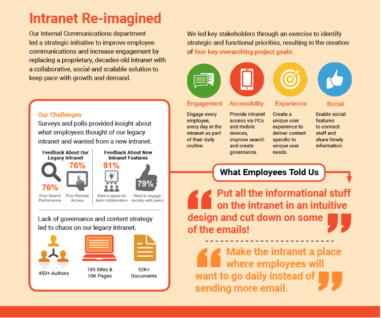
Healthcare providers Piedmont undertook in-depth stakeholder research, polls, surveys and focus groups to identify their users’ needs and requirements. They then developed personas for their distinct groups: Nurses, Physicians, Professionals and Remote Workers.
Piedmont visualizes this journey in their infographic about The Village, their intranet, below:
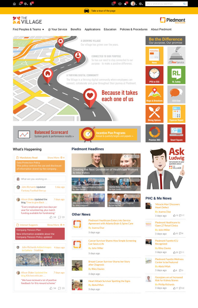
When it came to translating that in-depth understanding to their intranet homepage design, they took the approach of decision a unique homepage for their physician staff compared to the rest of their organization. A custom navigation gave them quick access to the systems they use most.
Alongside this, content widgets were configured for each persona to pull through the information and news relevant to their particular profession and seniority level.
Since the launch of our new intranet, there has been a significant increase in the number of employees who agree or strongly agree that they receive adequate communication about changes happening at Piedmont and the company’s future plans and directions.
Kelli Newman – Director of Internal Communications, Piedmont Healthcare
Step 3: WHERE will our intranet fit in our digital workplace?
If we’re designing our intranet homepage to be a gateway or springboard, perhaps one of the most crucial questions to ask is… to where ?
Successful digital workplaces consider the people they serve, the tools they use, and how everything comes together to deliver a positive experience for our employees. The intranet is just one piece of that much bigger puzzle.
The average enterprise boasts over 500 different applications as part of its technology stack.
When initiating intranet homepage design, you need to consider how to facilitate connections: between people, platforms, and information. To complete this, you need to:
- Determine how staff will find and connect with each other, for example, through your people directory
- Integrate your intranet with important existing tools and systems or consider how they’ll work together
- Consider using your intranet to sign into other applications with Single Sign-On (SSO)
- Adopt a ‘mobile first’ approach to design and ensure all employees – regardless of device or location – can access it
- Determine where and how those connections or signposts should work on your homepage
Intranet homepage design example: Travelex
With over 10,000 global employees dispersed worldwide and the demands of operating in a highly regulated industry, financial services provider Travelex deals with high volumes of people, platforms, and information.
When staff are unable to access what they need the organization sees inefficiencies, reduced productivity, an over-reliance on email, a break down in best practice and a resulting impact on customer service levels. To address those challenges, their intranet homepage design for The Lounge includes:
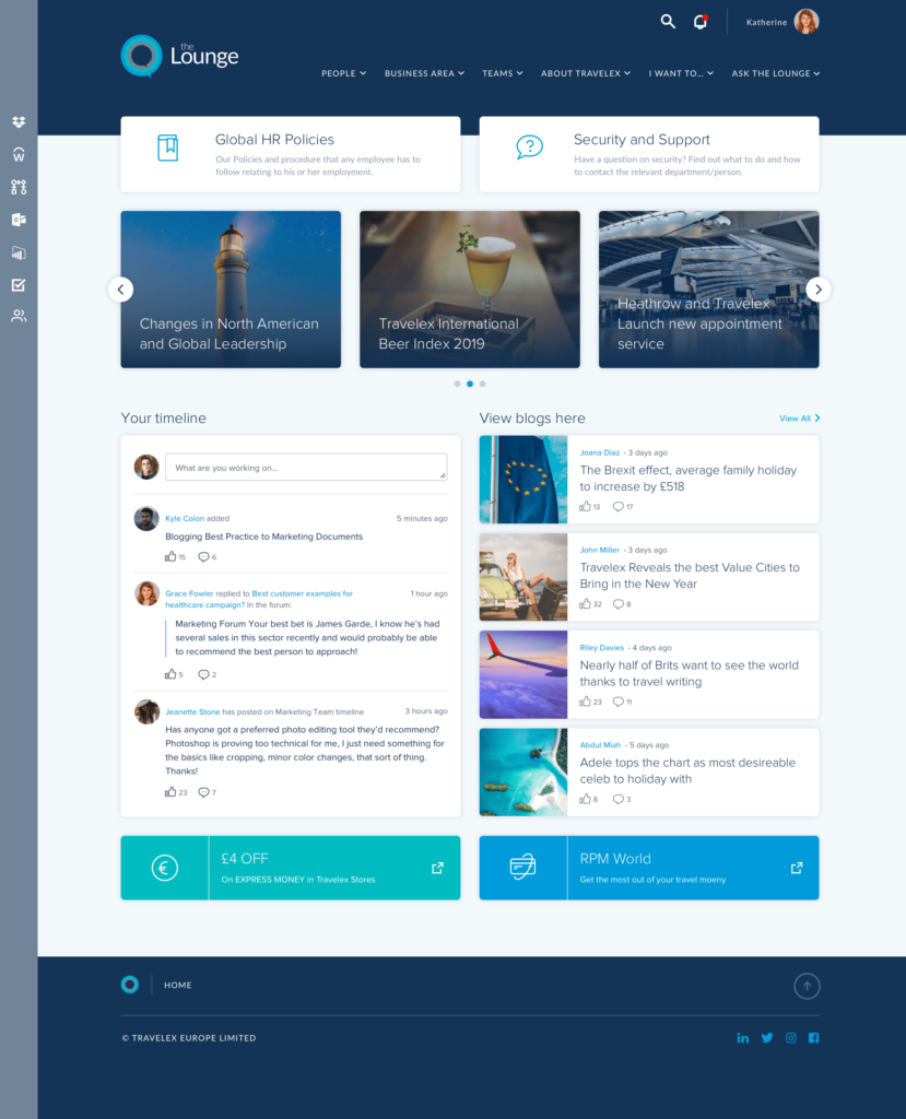
- An app bar with quick links to vital systems or tools, using single sign-on for optimum efficiency and time-saving
- Two prominent HTML widget buttons at the top of the ‘above the fold’ section, to direct users to its most high-traffic and in-demand areas for HR policies and Security and Support
- Centralized hosting of all critical policies, documentation and information, rather than on dispersed document management systems or on individual drives or desktops
- Enterprise search capability, to enable staff to search all connected and indexed platforms or information quickly and easily
- Individuals have the potential to ‘watch’ information or areas of the intranet, and be notified when an update affects them alongside any @mentions of themselves or their community
“The Lounge is relied on for everything we do now,” says Tricia Scott, Global Intranet Manager at Travelex.
“It’s easy for staff to access policies, forms, and information that directly affects them. They’re now better informed, and the time saved not relying so much on email we can now devote to customers.
“The Lounge has drastically reduced workloads for staff as email communications are reduced, forms are more efficient for managing processes, and colleagues are able to independently find information and tools to do their day job by searching on The Lounge and finding what they need in a matter of seconds.”
Step 4: HOW do we design winning intranet journeys and experiences?
If your intranet homepage is just the start of the user journey, how do you ensure the rest of the journey is logical, intuitive and easy for your staff to find what they need? How do you design user experiences that keep them coming back for more?
Failing to pay attention to the user experience when you design an intranet homepage will result in low adoption and a lack of returns. To fine-tune your user experience, you’ll need to:
- Conduct a ‘content audit’ of existing and proposed content, before grouping it logically and submitting it for user testing
- Consider carefully not only your navigation, but the governance around your content in terms of how it’s labeled, tagged, and sorted to ensure users can find it using search
- Consider accessibility, usability and the impact of aesthetics for all your different user groups
- Ensure it’s clear at every stage of the journey where a user needs to go next; through clear calls-to-action, signposting, navigation and more
- Test, test, and test again with those impacted by your intranet design: your users
This will ensure your employees not only feel they can use your intranet but actually enjoy doing so.
Intranet Design Guide
Intranet homepage design example: Kent Community Health NHS Foundation Trust
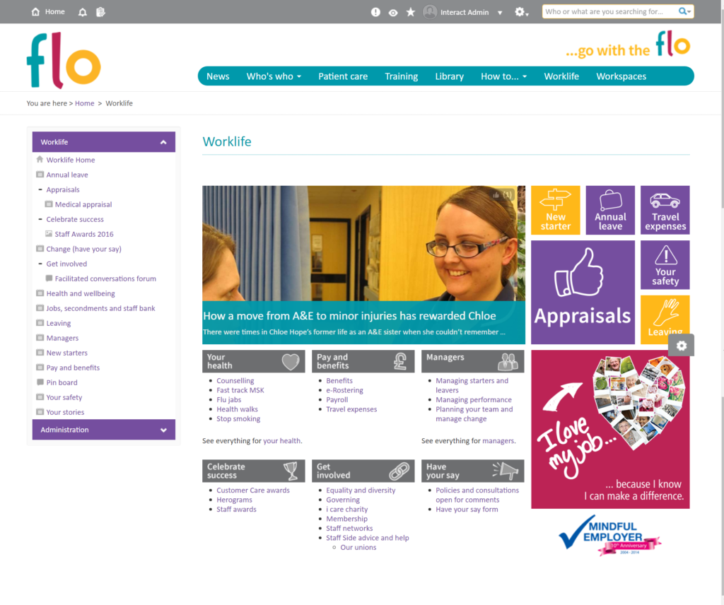
With a historic intranet structure centered on its organizational hierarchy – sorting information by department – the team at Kent Community Health NHS faced a difficult and unmanageable task when it came to the design of their new intranet, Flo.
The team decided to adopt a completely different approach, grouping content and pushing it to staff based on topic and how often it was needed, as an alternative.
This intranet homepage example is actually a content area homepage, rather than the main homepage. The homepage has:
- Content grouped by topic, theme or action, rather than department
- Quicklinks to high-use areas in order to signpost users to the areas they need to visit most
- Navigation – both at the top level and within the content area – is by topic, rather than departmental and reflects the cross-organizational way of working and accessing information
“We used our organizational structure to order content on our previous intranet, but this didn’t always reflect users’ needs. With Flo, that’s changed, and the most commonly used content takes precedence, making the experience much faster and more intuitive.
“We’ve also scaled down from 5,000 pages to just 1,200. It was a huge amount of work rewriting and consolidating the content, but it’s been well worth it in terms of navigability and user experience.” – Andy Crouch, Web and Digital Media Officer, Kent Community Health NHS Foundation Trust
Step 5: WHAT is out intranet identity and brand?
The part where we get to be truly creative and imaginative in our intranet homepage design: the look and feel. Brand and aesthetics are a powerful tool for engaging users, creating a sense of pride or ownership, and communicating your culture.
Employee turnover can be reduced by up to 28% by investing in your employer brand: this includes your internal brand.
Translating your objectives, vision and culture into something tangible can be challenging. Brand identity is normally brought to life through a combination of different elements including:

To get yours right, you’ll need to consider how to:
- Align with – but not duplicate – your external brand
- Define your tone of voice
- Give your intranet a name and logo
- Create an intranet identity or character
- Determine brand elements such as typography, color palette, and icons
- Create templates or style sheets and host brand materials on your intranet
- Establish guidance around brand use, if appropriate
Intranet Design Guide
Intranet homepage design example: Acorns
Children’s hospice, non-profit Acorns, has a challenging and emotive cause that can prove hard for employees. It was crucial for the team to unite employees behind its cause, share success and stories from the frontline, and consistently reiterate the importance of what their staff do day-in, day-out to improve the end-of-life care they offer young people.
The non-profit managed this through:
- Replicating their core external brand colors and the ‘brush effect’ around their buttons and modules, giving an important link and consistency to the external brand
- Replicating the use of the acorn in their logo, but playing on their brand name to give the intranet a unique identity
- Introducing fun, information, and child-like typography
- Using children’s drawings throughout, to focus users on the purpose and mission of the organization – the children it helps
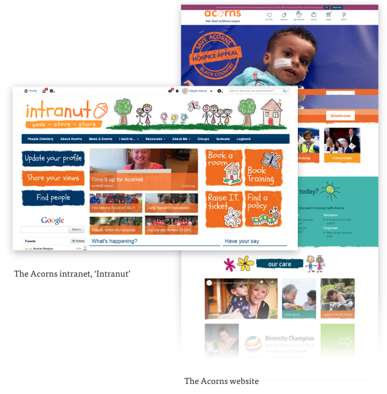
With such a vast assortment of staff and skillsets, the one thing everyone had in common was Acorns, with it’s very distinct culture and character. Therefore, the design and branding was essential in making sure the intranet “felt like Acorns” and was a place all of our staff wanted to visit.
Megan Keane, Digital Marcomms Officer, Acorns.
What’s the key to a great intranet homepage design?
If there’s one thing we’ve come to learn in designing hundreds upon hundreds of intranets in our time, it’s that there’s no ‘one size fits all’. There shouldn’t be. Every intranet homepage is unique and aligned to its own audience, organization, purpose and more.
With the sea of options available, it can feel overwhelming. However, the stakes are high when we leave design as an afterthought: it’s a practice worth getting right. Investing in a user-focused design that brings together creativity and an understanding of our purpose can dramatically impact on user adoption, engagement, and use: and, in turn, your return on investment.
These 5 simple steps are a basic framework or foundation to build upon. Where they can take you, however, is entirely in your hands.
