How Does Your Intranet Homepage Measure Up?
Being an intranet manager can often be a lonely place and coming up with new ideas for improving your intranet can be a difficult task, especially when you don’t have colleagues around you to share knowledge with and bounce ideas off. That is why many intranet managers enjoyed attending Interaction this year because as the UK’s largest intranet conference it gave them the opportunity to network and learn from others who are experiencing similar challenges.
In particular the brand new Intranet Homepage Wall was a massive hit and got everyone talking, debating and occasionally arguing! It also gave intranet managers a rare chance to see many intranet homepage designs in one place and gave them lots of ideas on how their own intranet might be improved.
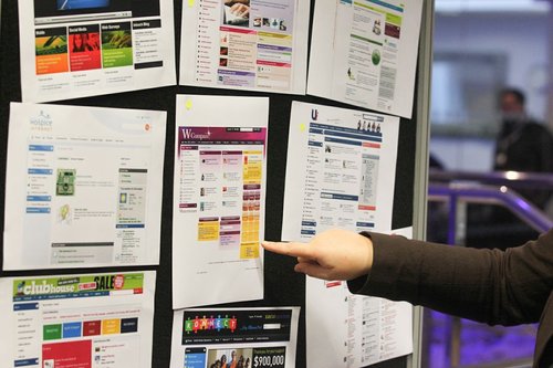
The Homepage Wall gave delegates the opportunity to select the homepage they thought was the best designed and most engaging and it was very interesting to see the votes come in over the two days. If you missed Interaction this year or didn’t get a chance to see the wall then here are the top three favourites and why we believe they got the most votes.
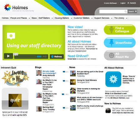
The clear winner was with the most votes was Glasgow Housing Association’s intranet homepage:
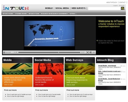
Kantar Operations was deemed the second favourite of the attendees:
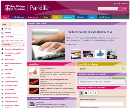
The Royal College of Physicians were third place:
So why do we think these homepages were the most popular amongst the Interaction crowd, which consisted of intranet and collaboration specialists and Interact customers? Our Interact Community Manager, Nigel Williams explains why he thinks the top three were voted for:
“What the results have shown us is that intranet design is highly subjective. However, what is interesting is that two of the three winners picked by attendees were awarded winner and runner up of our intranet design award, during the Intranet Excellence Awards. The third hadn’t been considered for the awards as it is still pending launch.
Although all three designs vary, there are some common traits which we advocate for good design. These include:
- All three homepages meet our design mantra, that when using a homepage for the very first time, it should be simple to know where to go, what to do and what to expect on your intranet. Simplicity is key!
- All of the top three show great examples of how you should use your homepage as the ‘shop window’ of your intranet and not show the entire ‘store.’
- They all have a certain amount of symmetry in the widget spacing – which encourages the user to view the whole screen rather than just the largest image or brightest colour.
- I like the good use of vibrant colours – which compliment but don’t dominate the content.
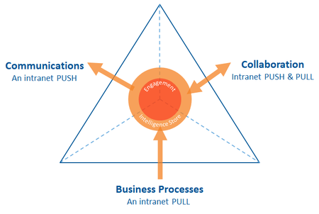
The selected homepages are fantastic examples of the essential blend of components needed to make an essential intranet for your organisation. For an intranet to become essential, it has to have the correct blend of three core qualities. It needs the right amount of communication; collaboration and business process tools to make sure that users are continually pulled to the intranet and also pushed the correct information to ensure they stay engaged.
Interact Intranet version 5.2 now has the ability to let you know if your homepage has the essential intranet blend. To find out more join the free online webinar on November 8th>>
