Get inspired: 3 award-winning intranet designs to emulate
When it comes to your intranet, the design is one of the first things noticed. What should you consider when designing or enriching the look of your intranet?
The formula for creating an effective intranet is made up of many different parts. Intranet managers must consider the right collaboration tools, communication strategies, launch plans and more. However, amid all those procedures, it is easy to lose focus of one crucial aspect – design.
Rather than new features or tools, the design of your intranet is the first thing employees experience. A proper intranet best practice starts, not with a list of features, but with the users’ requirements. Without an intuitive design, your fantastic content will go unnoticed.
While every intranet should have its own style, traits, and character, there are a few common factors that are shared among award-winning intranet templates:
A well-organized and designed intranet offers users:
- Easy customization, navigation, and functionality
- A branded design that reflects the organization
- Great UX that considers the overall user experience
- Intuitive, mobile and social intranet features
- A relevant and eye-catching homepage
Award-winning intranet design
Our 2019 Interact Excellence Awards honors some of the most successful and well-designed intranets in our award categories: The Best Intranet Design Award.
The Best Intranet Design Award celebrates best-in-class for creativity, user experience, and brand, and acknowledges the intranets that push the boundaries of design.
Out of this year’s contestants, the finalists with the best intranet designs were:
- Best Intranet Design winner:Institute for International Education, Eddie
- Best Intranet Design Runner-up:GBG, be/connected
- Best Intranet Design Runner-up:Curo Group, The Orb
These winning intranets focus on both user need and design to create an intranet that provides outstanding UX, intuitive features as well as an ideal visual design. Get inspired by these original design success stories.
Institute for International Education
IIE has crafted an intranet design that is user-friendly, sociable and catered to employees that are uncomfortable with both technology and change.
The Institute of International Education (IIE) is a non-profit world leader in international education. Founded in 1919, they strive to build more peaceful and equitable societies by advancing scholarship, building economies and promoting access to opportunity.
The institute had a legacy intranet platform, build on Microsoft SharePoint technology, which was failing to meet its needs.
More than just missing features necessary for social collaboration and communication, staff claimed the design felt too corporate. Furthermore, search functions were lacking and finding key documents provided a barrier to effective working.
To create a virtual community, IIE began their design from scratch. This started with a competition to name the new intranet as a way to garner user support and discover what they truly needed. IIE settled on the name “Eddie,” something informal that demonstrated the move away from their old corporate-style intranet.
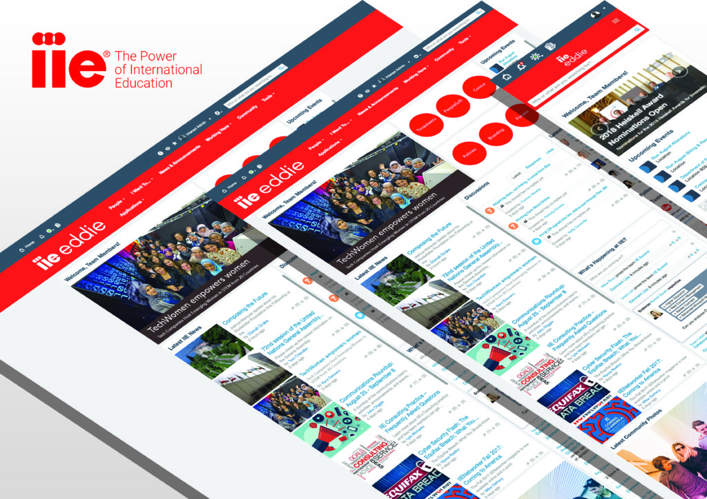
In line with this thinking, IIE’s focus lay with more social collaboration, improving the user experience and easier knowledge sharing.
Interact’s forums and rewards features easily grew collaboration on the site. IIE also made great use of their homepage, publishing organization-wide news to keep employees updated.
With the help of their quirky mascot, Eddie the Owl, IIE produced an intranet that is friendly, approachable and catered to employees that are uncomfortable with both technology and change.
Eddie was hosted on almost every angle of the site since his “hatching.”
Before designing Eddie, IIE would see two new blogs max per month. Now, in a month, six new blogs were published by staff across the organization on a variety of topics ranging from community service to social media best practices to women in education. See more about IIE’s challenges and successes here.
GBG
GBG is an identity management specialist organization, headquartered in Chester, England. Inspired by their brandguidelines on the color palette, style, and design, The GBG team designed and a site structure that was clean and simple, yet, visually appealing.
As GBG contained to grow and evolve in tandem with their industry, it was crucial to develop an intranet that improved internal communications, reduced email count and supported the distribution company updates.
be/connected was created and launched in August 2017 with the support of Interact.
Since then, GBG has continually developed its platform to meet the ever-changing business needs. A large part of these growing needs was highlighted through their intranet design.
At the start of these projects, GBG hosted regular half-day research sessions where the champions and comms team gathered together to map out the site structure.
The vision was that GBG would have the “best and most engaged team in the industry.”
To improve UX across all sections of the site, GBG enhanced specific areas of the platform including news subsections, content categories, and unique team pages.
In addition to this, they used Interact’s HTML capability to bring in external elements that would make the navigation of our platform easier.
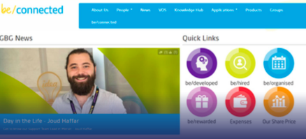
Many of the processes for the teams at GBG have been simplified, a massive difference for staff.
Their current site structure now focuses majorly on business requirements, news sharing and on-boarding new employees. Information is made even more accessible through their Knowledge Hub, a resource center broken up into different departments with the exact layout of each section depending on the nature of the resources available.
Keeping all employees on the same page takes work, but GBG makes all resources easy to find and easy to understand for all users.
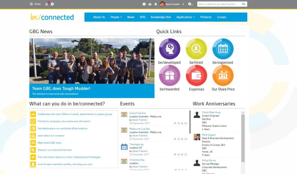
“GBG has done a great job with design, managing to retain their essential layout structure while including a broad range social of and collaborative tools. A really good design with a great model and great results.”
Simon Dance, Best Design
Curo Group
Based in Bath, Curo is a housing association and house-builder committed to providing excellent homes and high-quality care and support services.
Before choosing to partner with Interact, Curo had a pre-existing platform built and managed internally on Umbraco software. However, not being maintained nor managed meant that users found it difficult to navigate the site. The staff saw it more as a tool for one way communication rather than overall collaboration.
A mobile version was crucial to pushing satisfy a range of access requirements and quickly provide colleagues with pertinent information.
“We needed an intranet that would help our colleagues to find the information they need at an easy click of a button and something that could work for all of our colleague roles.”
Becky Davies, Communications Officer, Curo
Curo launched their intranet ‘the Orb’ in 2014 and subsequently went through a design/content refresh in 2017.
The new design needed to cater to users who had limited time, who need to use their mobile device to gain remote access to content, or who want to get involved and feel like part of the Curo community.
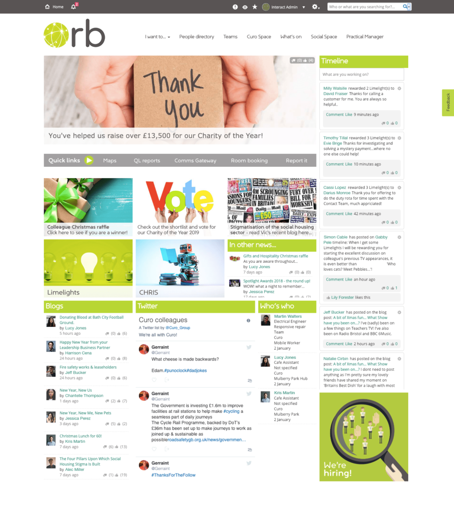
Curo decided to design the Orb as a colleague platform. A place for users to contribute content, take ownership, and feel like part of the Curo community.
A group of 13 Content Managers was selected to solve the issue of low search and navigation. Curo went live with the full range of features including Rewards, Blogs and more:
GBG took a creative approach to their icon-led site. The design is dynamic, with content updating regularly as widgets pull through news, blogs and new starters to provide a snapshot of what’s happening in the business. The homepage is used to showcase fundraising campaigns, events and celebrate successes to drive positive news to staff.
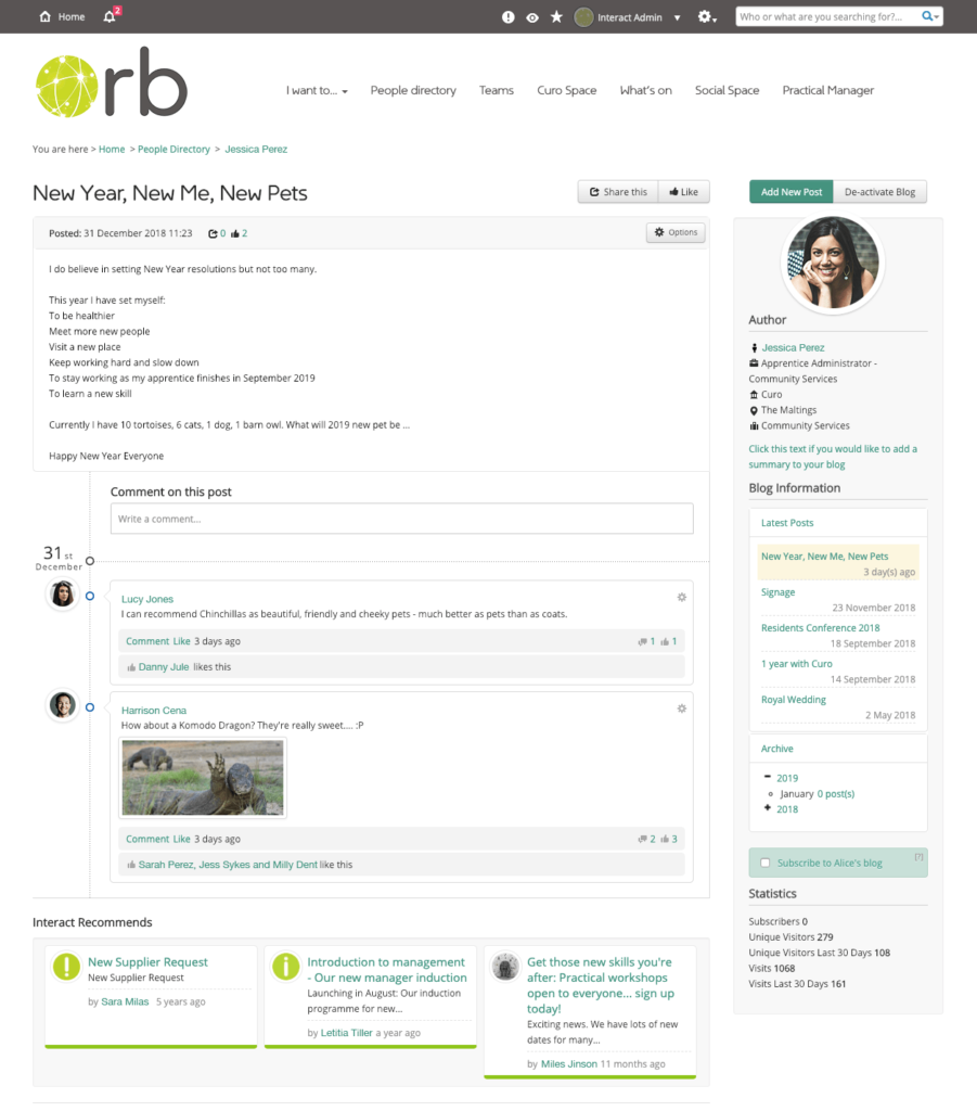
They continue to inspire a social vibe using fun, engaging imagery that showcases their values and brand.
Congrats to all our finalists and winners that competed for the Best Intranet Design award. For a closer look at the overwhelming success of all of our finalists, download our “Intranet Excellence Award Annual” available here.
