Best intranet design: 3 award-winning intranets that will influence your next project
When considering the makings of the best intranet platforms, many communicators focus first on the software and secondly on the content. But a winning brand identity for your intranet goes beyond just great content. With so much of communication being visual these days, users are now beginning to value design just as much as content.
In the everlasting quest to get maximum employee engagement, design is often ignored in favor of content. But that line of thinking can backfire. Without an eye-catching and intuitive design, your amazing content will just fly under the radar.
Every popular intranet has its own style, traits, and character, so taking a ‘one size fits all’ approach to your intranet design will not work. However, while there may not be a defined template for design success, there are a few common factors that are shared among truly outstanding intranets.
A well-organized and designed intranet offers users:
- Ease of use: easy customization, navigation, and functionality
- A branded design that reflects the organization’s image and is easily identifiable
- Great UX that considers the satisfaction, usability, accessibility, and overall user experience
- Intuitive and social intranet features that cater to the mobile workforce
- A relevant and eye-catching homepage
- Information architecture and navigation
Intranet best practice starts not with a list of features but with the users need. The organizations that place their focus on their users and treat them as a driving force for all major intranet design decisions are those with the most success.
Award-winning intranets
Our 2017 Interact Excellence Awards honors these successful and well-designed intranets in our award category: The Best Intranet Design Award.
The Best Design category applauds customers that who push the boundaries of design to give their employees a brilliant user experience.
Out of this year’s brilliant contestants, the finalists for the best intranet designs were:
- Best Intranet Design winner: Sheetz, Bob.com
- Best Intranet Design Runner-up: Bauer Media, Media Vine
- Best Intranet Design Runner-up: GBG, be/connected
These winning intranets push past the conventional boundaries of design to create an intranet that not only provides outstanding user experience and is an overall pleasure to use but also speaks volumes with its visual design. Take a cue from these inventive success stories.
Sheetz, BOB.com
Great use of imagery, including a non-traditional top navigation structure
Sheetz is one of America’s fastest-growing, family-owned-and-operated convenience retailers with a mission to continually reinvent itself and bring innovation to the industry. They applied this same innovative spirit to the creation and design of their intranet, BOB.com.
Sheetz suffered from an outdated, nine-year-old intranet, which was frustrating to navigate and lacking a useful information architecture. 36% of respondents spent more than an hour a day searching for the information they needed.
Alongside Interact, Sheetz began revamping their intranet, with functionality reigning at the top of their priority list. With numerous complaints logged about poor search capabilities, great importance was placed on a design that would not only improve efficiency but also ensure their 18,000 employees could find the information they required quickly and from any location.
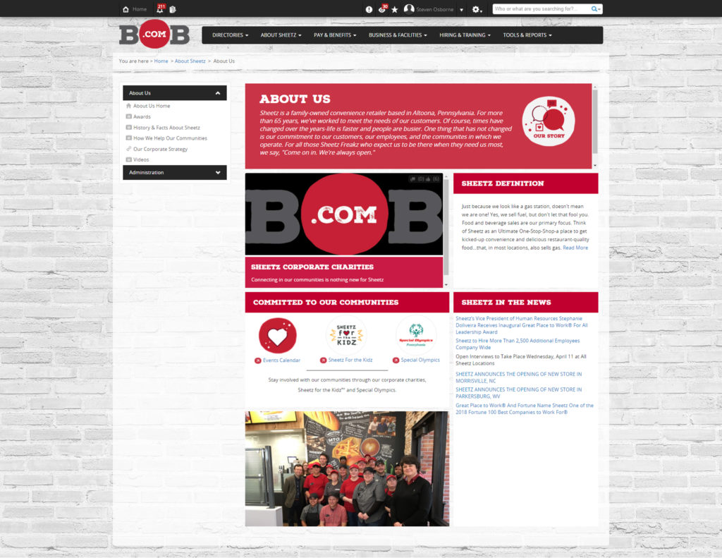
They began by taking a nontraditional approach to the top navigation bar with splash screens, designed to display longer, top-level navigation in an easy-to-use tile format.
BOB.com’s navigation structure:
- Provides a definite home for information
- Stays consistent over time
- Allows administrators to manage content easily;
- Is easy for new employees to traverse
Sheetz did not stop at improving navigation; they also did a brilliant job applying their brand into their intranet design. When they refreshed their design, they wanted their internal brand experience to reflect the same experience as their external.
They decided that BOB.com had to be built with a mobile-first mentality, so we kept everything clean, and simple. Sheetz was also sure to address the pain points noted during the initial interview stages with their employees.
The areas that were customized throughout the redesign:
- A mobile-first design utilizing free text widgets for tiles
- Images used as headers on landing areas
- Free text widgets customized for visually-appealing ‘link farms’
- Accordion style text used for long, complicated documents
These customizations allowed users to pull through information in a visually appealing way and according to the results, employees approved. Since May, there have been 10,718 visits to the site and 90% of all active users have visited the new site.
Bauer Media, Media Vine

App inspired design for tablet and mobile & a great news area
Bauer Media Group is a European- based media company that has around 3,000 employees in the UK, operating such publications as Closer and Grazia. With Bauer being a media house, their uninspiring, hard to use and unattractive legacy intranet was unable to accurately represent the innovative and creative way they run their business.
This lack propelled Bauer’s desire to begin the upgrade they’d always wanted, and with the help of interact, Media Vine was born. Redesign was a priority and involved a complete overhaul of the sire and the removal of their old, hated pixelated images,
Employees also called for an intranet design that was more image focused and sported more app-like widgets for greater ease of navigation. In response, Bauer turned everything on their homepage into a clickable button.
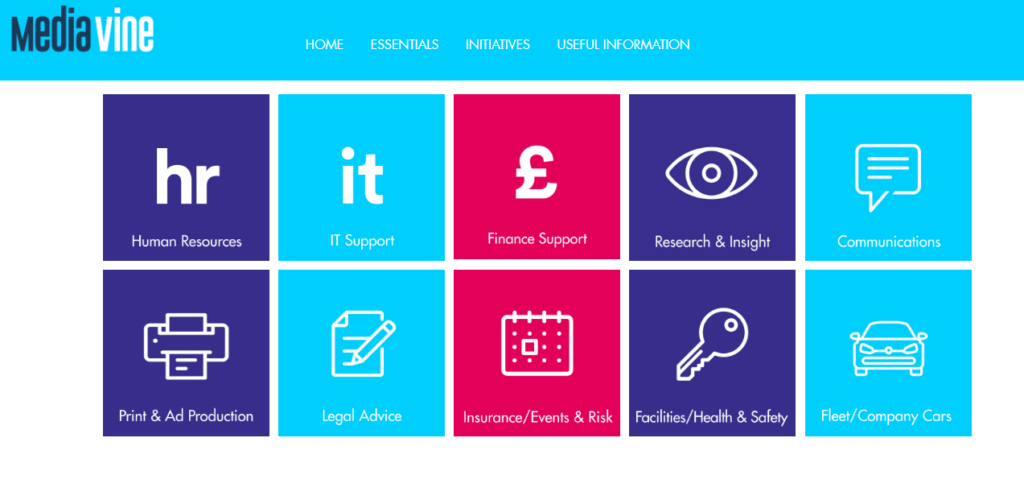
‘Quicklinks’ that serve as app-like buttons effortlessly sent users to external sites such as HR and other key information.
They also took a new approach to their homepage, forgoing a dated and deficient homepage newsfeed for a scrolling banner at the top that highlighted the most important and relevant news. This was coupled with a ‘More News’ content area for other news. The combination solved the staff’s issue of being bombarded with irrelevant and lackluster content.
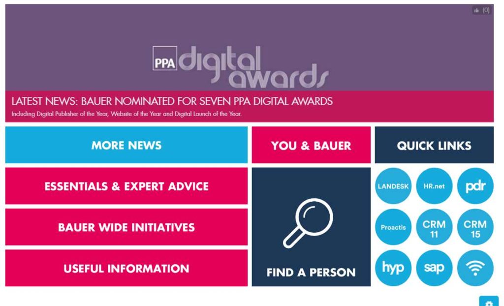
This content area, which they initially feared would lower the engagement of their employees, quickly became the most popular area since Media Vine’s launch. The More News area averaged 5,000 visits per month.
Various widgets and features were also added to the homepage design:
- Video highlight widget – celebrating individual work and sharing their most recent marketing success to create a feeling of unity across the business.
- Initiatives area – highlights areas of the business that warrant special recognition and could benefit from collaboration within the industry
- Team Contacts widget – was placed to aid collaboration for teams
- ‘Useful Information’ header – which mixes external links and pages to keep the number of documents on Media Vine to a minimum.
The intranet relaunch aimed to make content more accessible and effective and Bauer accomplished just that. The new design was a hit among the staff, focus groups were extremely positive about it and found the site so much easier to use.
GBG, be/connected

Great content area design and use of ‘hidden’ fields to drive the user journey
GBG is an identity management specialist organization, headquartered in Chester, England. That has expanded into an international organization with nearly 800 employees, spread across 21 locations, in almost 20 countries.
With more than 800 staff dispersed across several office locations, it was essential to deliver an intranet that provided users with easy access to news, information, and resources.
GBG outlined several objectives which it hoped to accomplish with the help of Interact:
- Improve internal communication and collaboration
- Reduce the copious amount of email traffic
- Improve employee engagement
- Actively encourage feedback from staff
To begin, GBG started with their vision: that GBG would have the “best and most engaged team in the industry.” Eventually, they arrived at the new employee brand: be@GBG.
To truly develop their brand identity, GBG placed intranet design and functionality on the top of their priority list.
Deciding what they wanted the system to do required background research. Afterward, they met with team members across the globe and got a team of people together from all around the business who became ‘be/connected champions.’
The site structure was designed and built using the be@GBG brand guidelines to help GBG decide on the color palette, the style, and the design – the effect had to be clean and simple but visually appealing. Together with the Interact design team, GBG came up with the design that they were extremely proud of.
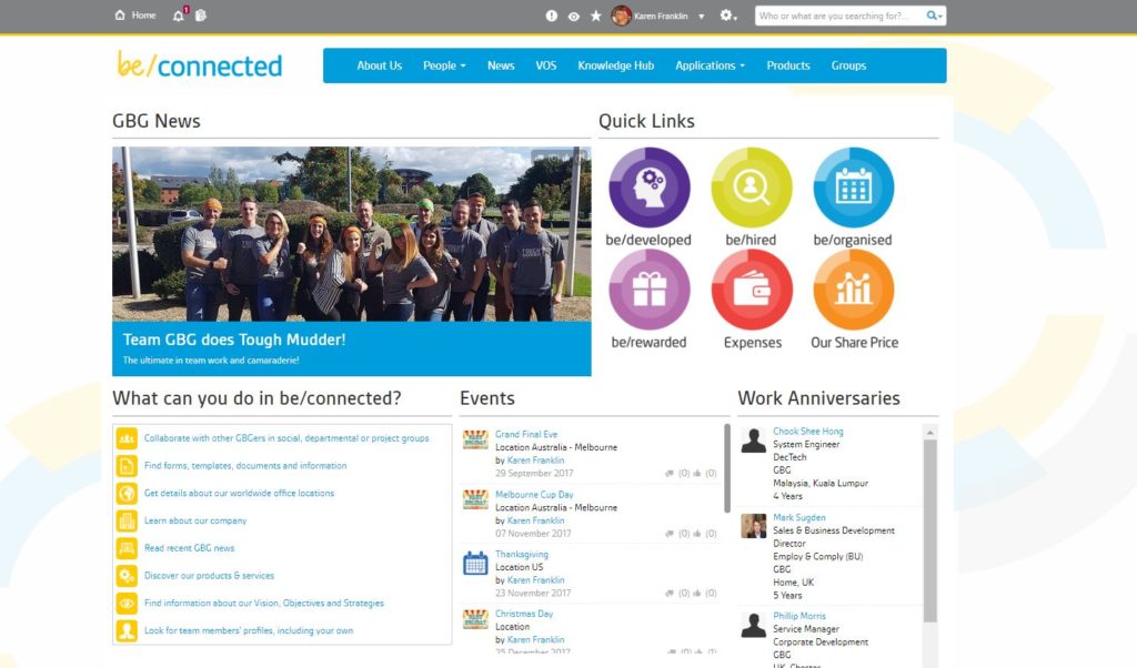
Quick links took the team to other systems under the be@GBG employee brand – systems they need to access daily; a method that has simplified many processes for the teams at GBG and made a massive difference for staff.
Demo webinars were run, showcasing the site as it was being built and allowing staff to provide some honest feedback which helped structure the new platform.
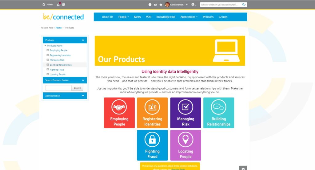
With all these new features, the be/connected design was guaranteed to resonate well with the GBG team.
GBG continuously tackled and solved user needs and have the results to prove it. They continue to have regular demo webinar sessions to highlight the different areas of the site, an encourage usage. These have created considerable interest and loads of suggestions on new ways to be/connected.
All of our finalists realized the importance of balancing out what their intranet does – regarding its functionality and the overall user experience. Designed expertly, your intranet brand is a powerful tool to shape how your employees feel about your organization and its purpose.
Is it easy to use, deploy, and maintain? Will it deliver a great UX for our employees?
Keep these questions in mind as you embark on the journey to designing your own intranet.
A big thank you and congrats to our finalists and winners that participated in the Best Intranet Design competition. For a closer look at the tremendous success of all of our finalists and their well-designed intranets, download our INT Guide, ‘What makes an award-winning intranet available here on Interact’s Resource page.
