Nailing your intranet design is crucial to getting good adoption and engagement from your employees. Let’s explore the common intranet design mistakes to avoid so you can get the best out of your investment.
Design can make or break an intranet. If you don’t put plenty of consideration into your intranet design then poor user experience (UX) can quickly lead to low adoption and even lower engagement.
Of course, we’re not all designers. Some of us may be skilled at putting together an aesthetically pleasing PowerPoint presentation or making our Instagram feeds look on-point, but when it comes to designing an intranet that employees will love, it pays to take some expert design advice.
If you’re considering intranet design as part of reinvigorating or planning an intranet, how should you approach design if you don’t have access to a team of intranet design gurus? There’s plenty of content out there about what makes the best intranet design, but wouldn’t it be handy to understand the common pitfalls that make a bad one too?
Get inspired by best-in-class intranet designs, guaranteed to engage your employees
Read on to understand the basic principles of intranet design and discover the common mistakes you should avoid.
The basic principles of intranet design
Design is about more than just making something pleasing to look at. Design-thinking takes other elements into consideration too, such as usability and how using the end product makes people feel.
- Function: does it do what it’s supposed to, and does it do it well? (e.g., does your intranet homepage act as a digital hub that allows staff to easily access information and processes in one place?)
- Experience: do people feel good about using it? (e.g., are employees engaging with content and is the number of daily and monthly active users increasing?)
- Aesthetics: does it do both of the above AND look good? (e.g., is the design customized and themed in a way that resonates with your brand and company culture?)
When these elements aren’t taken into consideration, organizations may experience poor productivity, frustrated end users, and a negatively impacted employee experience.
Don’t forget to pick an intranet name that reflects your internal brand.
7 common intranet design mistakes to avoid
#1: Not listening to users
An engaging intranet UX design should be built around end-user requirements. This may seem obvious, but it’s something that has often been overlooked in failing intranets.
While listing out what your people need and want may appear easy, you can’t guarantee that you’re getting their needs right unless you work directly with them to understand their requirements. Only then can you be sure that you understand their needs and can design an intranet that works how they do.
For example, a task-driven design based on users’ everyday needs with easy access to workflow and forms for tasks (such as ordering supplies or booking leave) can smooth the employee experience for time-crunched employees. In addition, placing quick links to in-demand information or applications in the side menu can speed up the workflow significantly.
It’s worth engaging with users throughout the entire intranet design, build, and rollout process to ensure you’re not just understanding their needs, but that you’re also delivering on them. This can be achieved through surveys, work shadowing, and ongoing consultation with people from across your organization.
#2: Obstructing search
In an age when ‘Google’ is recognized as a verb, we’re all accustomed to finding what we want instantly, and we expect other technologies to follow suit. In the context of an intranet, this is a justified expectation as people want to perform efficiently and experience as little friction as possible. In today’s dispersed digital workplaces though, surfacing the right content from multiple DMS sites with varying security permissions can be a vexing part of the employee experience.
Get inspired by best-in-class intranet designs, guaranteed to engage your employees
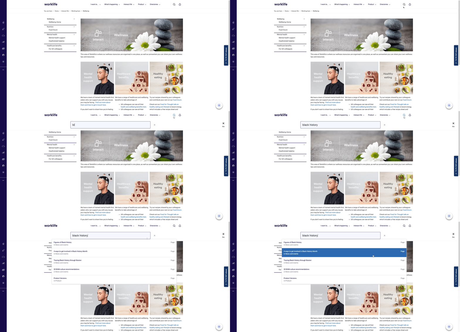
This can be remedied by making enterprise search accessible everywhere within your intranet (including mobile). Technically, this requires integrations with digital sources, such as OneDrive, SharePoint, Google Drive, and Box (connections that are standard within modern intranet software), but from a design perspective, you can also make search accessible on every page of your intranet by keeping search visible in a floating top menu. This ensures people are never more than a click away from surfacing what they need from any of your connected digital repositories.

#3: Making your homepage too focused on top-down comms
Another area where some organizations make intranet design mistakes is with the flow of comms. Don’t just make your homepage about top-down, push comms. If you want to create a unified company culture, consider your homepage as a site where employees can share and connect with each other via social features and peer-to-peer communication.
For example, placing a discussion board widget on your homepage alongside your news feed will allow your people to connect, but it also embeds a unifying shortcut by visually presenting a balance between top-down comms and interactions between employees at all levels. Other employee-generated content, such as blogs, can also be featured on your intranet homepage to help strike the right balance.
Enabling likes, comments, and @mentioning of people, content, and teams can also facilitate better communication and create an enterprise social network.
#4: Overloading navigation menus
When you dine out, isn’t it dismaying when the menu feels endless? Forget for a second that this is a tell-tale sign that the microwave oven is working harder than the chef – the point we’re getting at is that you don’t want to be spending half of your evening looking through countless dishes that you don’t want until you find the one you do want. The same goes for your intranet navigation menus. You don’t want to hamper employees from finding what they need quickly.
All too easily, navigation menus can end up as bulky, overwhelming, department-focused affairs, which is counterintuitive to creating a frictionless employee experience. To help users find what they need easily, consider grouping local content together, or consider the content areas or pages that will be more in demand, therefore more deserving of a prominent position within the menu.
Intranet navigation menu best practice rules:
- Use between 4-7 options
- Avoid using a two-line top menu
- Remember, your search functionality can help users find pages that are less in-demand
- Consider a solution-focused navigation rather than a departmental one
#5: Going too heavy on text
While you will undoubtedly have plenty of content to host and share via your intranet, we recommend avoiding intranet design mistakes based around the balance of text and other media. To keep users engaged and improve readability, use banners, images, videos, and even GIFs too.
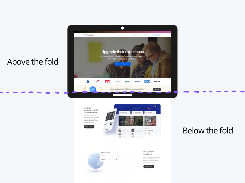
Some pages, such as those outlining policies and procedures, may demand a lot of text, and your people won’t expect these to be broken up by other media, but areas like your intranet homepage will be far more palatable when there is a text-media balance. For example, a hero banner that uses the space ‘above the fold’ on your homepage is an eye-catching element that can engage users and promote relevant content to your audience.

Modular content boxes are also a great option for pushing important news and communications above the fold, so they will be up-to-date and in-tune with all the latest developments when they access your intranet homepage. You can also break the homepage up with widgets that promote different content areas, and rich content sections that feature video or image-based content.
Get inspired by best-in-class intranet designs, guaranteed to engage your employees
#6: Underestimating the power of blank space
Blank space – also referred to as white space, or negative space – can allow content to breathe, provide balance on a page, and ensure things don’t look busy or cluttered. Used in the right way, white space can help to guide users where they need to go on the page because it prevents busy designs from overloading their senses.
Blank space doesn’t necessarily have to be white space, though. You might choose a different hue from your brand’s color palette, but as long as you’re leaving a decent amount of space on each page and between the blocks of content on them, then you can create a far friendlier and easier-to-navigate user experience without being too minimalist.
Don’t let this put you off from using a patterned background if you want to, but remember to make sure it’s a subtle pattern or faded image so that the page doesn’t end up distracting users by being too busy or confusing.
#7: Forgetting about accessibility
Accessible communication is one of the most important functions of an intranet. Designing a new intranet for your organization is exciting (we think so anyway), but while it’s easy to get swept up in the aesthetics of your new platform, it’s important to take a step back and consider how your intranet will function from an accessibility perspective too. Your intranet’s function is to connect employees with information, tools, and each other, and going too wild with design can restrict functionality by making accessibility difficult for users.
For example using a very light on a white background can make it challenging to read for users who are color blind or have visual impairments. And, while you might love that italic brush script that emanates beachside café vibes, it’s important to make sure text is easy to read (and on-brand).
It’s best to use no more than two fonts, and these should be a regular weight rather than thin or ultra thin, although bold is definitely acceptable where necessary. Popular web-based fonts that are easy to read include Arial, Helvetica, and Roboto. When it comes to font size, 15 or 16px are often recommended for accessibility.
Future-proof your intranet design
The possibilities are seemingly endless when it comes to envisioning how your intranet will look, but it’s important to find the right blend of design creativity and functionality that overcomes today’s comms challenges and readies your organization for the future of internal communications.
Enterprises that avoid the common design mistakes that we’ve outlined can expect to see better adoption and engagement rates from their employees, and a positive impact on the overall digital employee experience.
We hope these insights will prove useful for you when it comes to refining your ultimate intranet design!


