What to consider when designing or enhancing the look of your intranet software?
When talking about effective intranet design, especially when you’re creating your intranet, it’s very easy to become blinkered and solely focus on your homepage. After all, it’s the shop window of your internal brand and values, it will be one of the areas your stakeholders have floods of opinions on and it’s visual, which always gets people excited, both those viewing and those creating it.
Intranet Design Guide
We can share loads of intranet design examples, and have done, of great homepages – you just have to check out our Intranet Design Annual 2016. Just to share one more (you know I can’t resist), The Wildfowl & Wetlands Trust (WWT) has produced a great example of what an engaging homepage looks like:
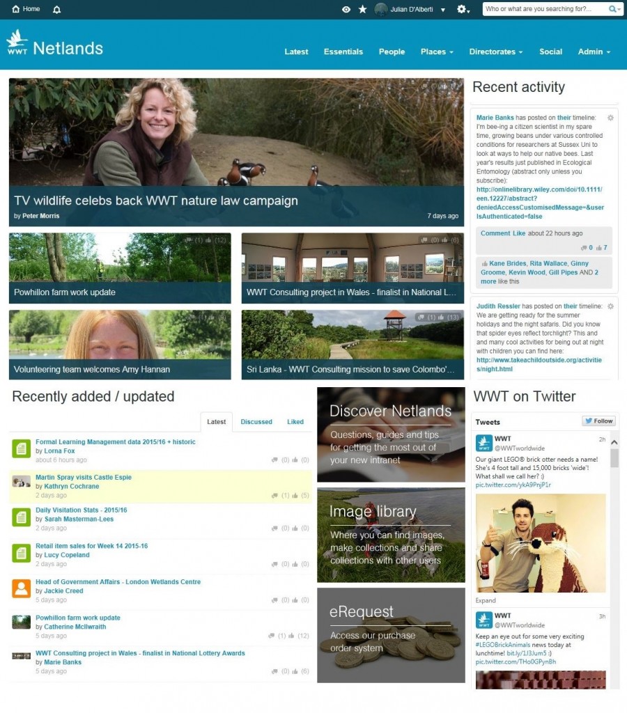
With all this mind and more, we are not saying it’s not important to get your homepage right – Jo Sullivan’s blog, There’s no page like home, includes some great tips and examples. What we are saying, however, is if you focus solely on your intranet homepage, you miss a whole host of opportunities to get your message across to your audience and create an engaging site which won’t just be looked at occasionally, but used every day.
The power of intranet background designs
Intranet backgrounds have been a long forgotten key element of design. Yet I confidently state that you will rarely, if ever, see a design awards finalist without a background. Where backgrounds may have at one time been deemed visual noise, it has reinvented itself as a key an element in intranet design as the name, logo and homepage design.
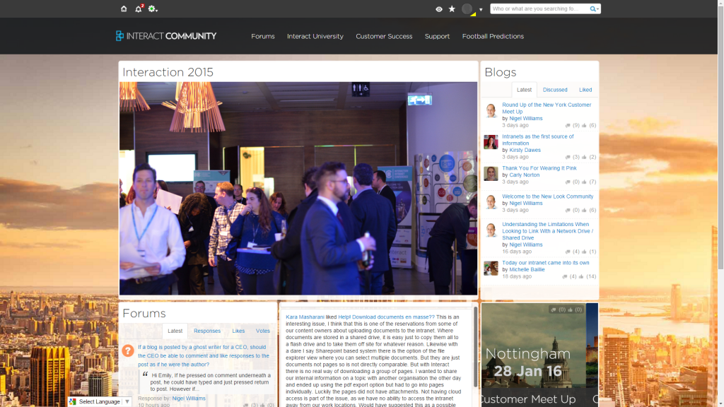
The Interact Customer Community has recently introduced a redesign and background image. We did this as I wanted to start people thinking about the appearance of their own intranet site and how to make it more effective:
However we aren’t innovators in this, this is something our customers have been doing for a while.
Take Stockport Homes. The background of their intranet, The HOG, changes with the seasons:
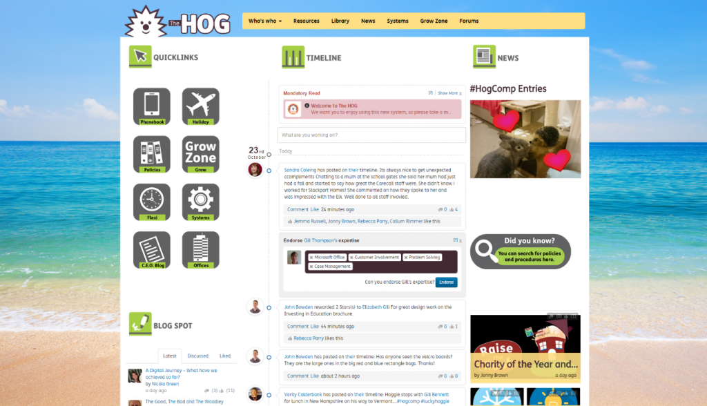
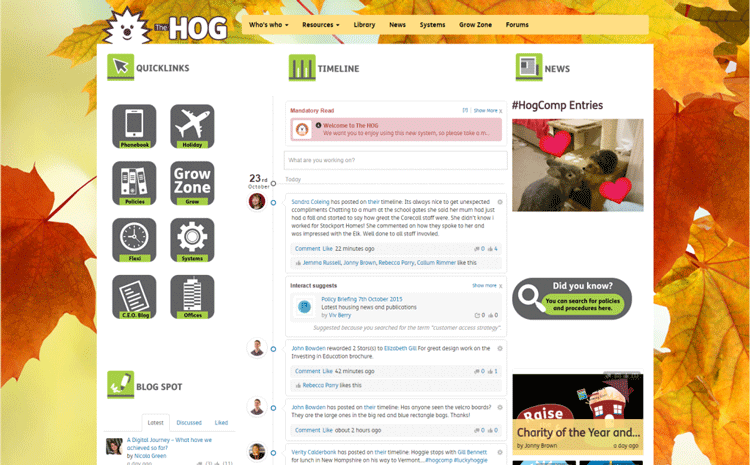
Verity Calderbank, Marketing & Communications Manager, Stockport Homes, explains how everything they do on their intranet software is done to help achieve their objectives:
It’s not very corporate…No it isn’t! We wanted something different to improve communication between staff; helping those on the front line keep up to date with corporate news and helping those at the centre better understand how services are being delivered on the ground.
You might choose to use this approach initially for Christmas or a major company celebration to give a new identity to your site. However, it doesn’t necessarily need to be seasonal. Take University of South Wales‘ approach with an iconic view of their library.
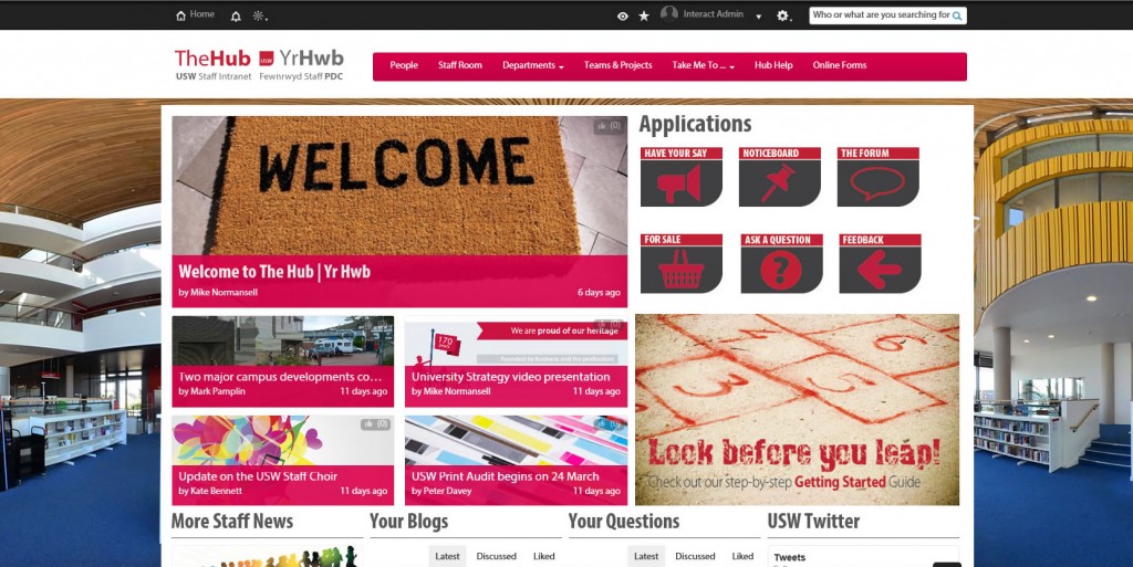
Choose something that means something to your company. I’d extend this logic to naming your site too, which I explain further in my blog – 5 rules to choosing the right intranet name.
Intranet Design Guide
Consider your intranet logo
Royal College of Nursing (RCN) has gone for a brave, striking background to their intranet site:
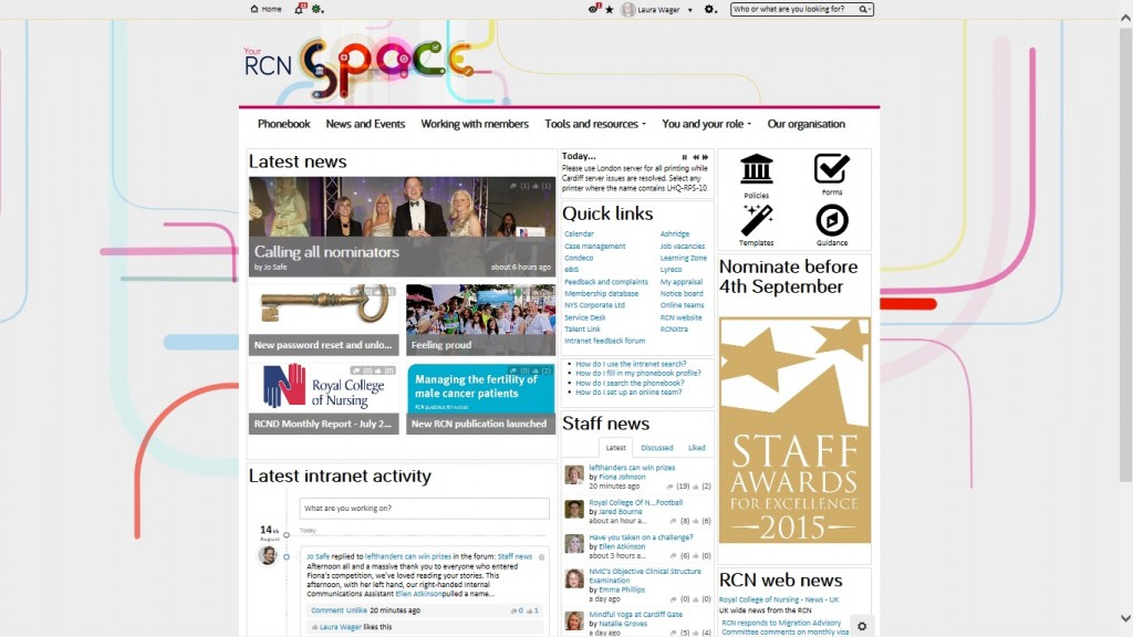
This has been highly effective, as Laura Wager, Internal Communications Manager confirms:
We’ve got a long way to go, but overall feedback from staff has been really positive, with one staff member telling me yesterday: ‘I love it when the intranet pops open every morning – the colours and everything, it’s so cheery! It makes me smile.
Not only is the background strong, the logo is distinct and impressive. If you saw the Space logo outside the context of RCN’s intranet, you would still recognise it. This gives that intranet a strong brand that employees can more easily relate to, building engagement and effortless adoption.

Laura will be appearing as a guest blogger very soon to share the differences their intranet software has made. Subscribe to our blogs by filling in your details on the left to make sure you don’t miss out!
Following the association with the change in seasons, David Groom, Optimisation Specialist at Mediterranean Shipping Company (MSC), shared the seasonal amendments they make to their site’s logo:


Simple intranet colour schemes
We are seeing more and more Interact customers changing the colour scheme of the intranet site according to specific events.
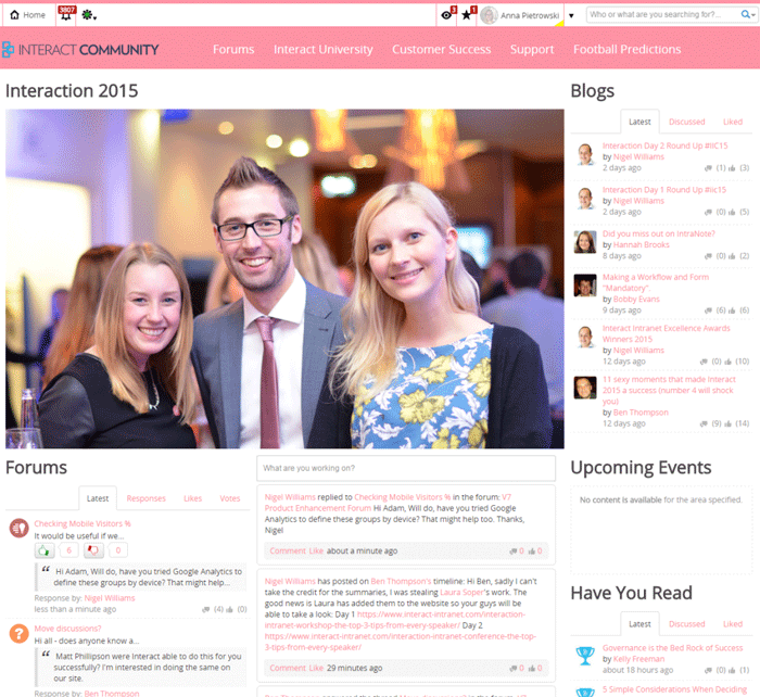
The Interact Customer Community ‘wore it pink’ in October 2015 on behalf of Breast Cancer Now:
Breast Cancer Now has kept the internal and external branding consistent to reinforce a newly merged brand, using pink and grey throughout their intranet site:
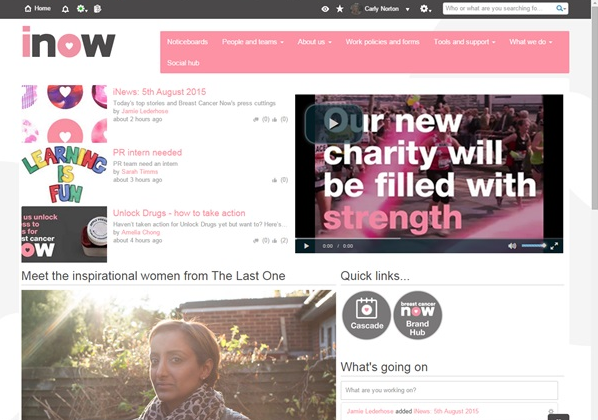
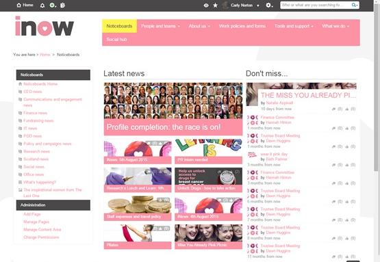
Carly Norton, Internal Communications Officer, shares more of Breast Cancer Now’s story in her blog, Embedding a new brand within the hearts of employees.
Intranet Design Guide
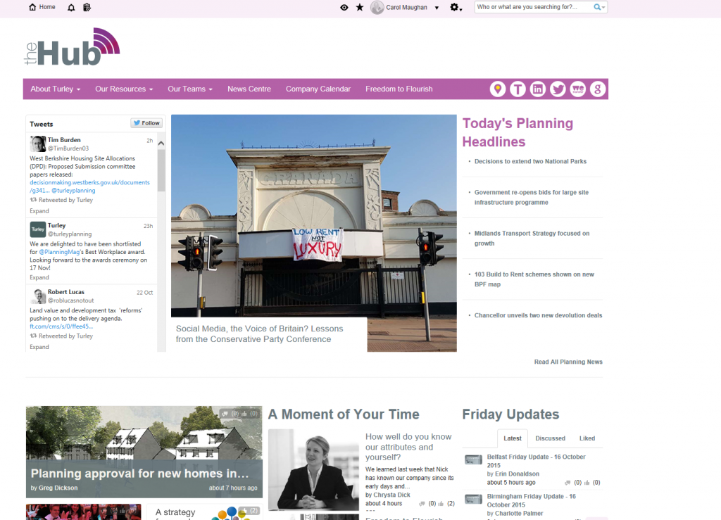
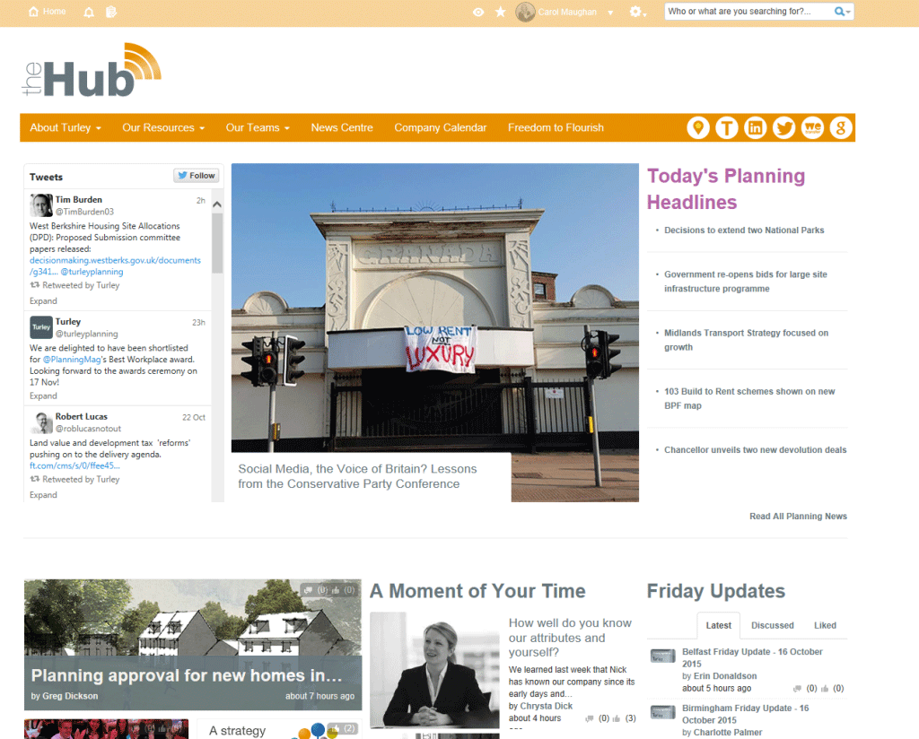
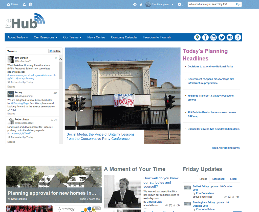
Carol Maughan, Head of Digital Communications at Turley, has seven colour schemes which change from the default purple brand when a specifc area of the intranet has key breaking news. This enables users to instantly see that something critical has changed as soon as they visit the site:
