7 Best Employee Intranet examples guaranteed to improve employee engagement
The Ragan Awards are big…actually that’s like saying The Green Mile was quite a good film, they’re huge!
Making the final in these awards is a major career highlight and we are incredibly proud of all seven customers who have been shortlisted for these awards. In the finals they will be competing against the likes of Yahoo and IBM, companies who don’t just have an intranet team, but an intranet army. An even greater achievement as none of the seven Interact finalists are full-time Intranet Managers.
Intranet Design Guide
Winners will be announced within the next four weeks and given customers’ success in previous years, we’re expecting quite a celebration!
Best Viral Campaign Finalist: Magenta Living – YETI
Joanna Harvey’s YETI is understandably a hit with the judges.
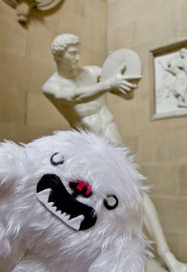
He is a character displayed prominently across the intranet at Magenta Living. He is there as a friendly, recognisable face to help staff navigate across the intranet. YETI has his own profile, he uploads information and writes his own blogs, he likes and comments on other people’s posts, blogs and forums, which helps create further buy-in with staff by corresponding with him directly.
There is an Ask YETI section, which is like a FAQ area so staff can post questions and YETI answers directly. There is a video which gives staff a helpful guide around the intranet (narrated by YETI) with some hints and tips, which not only helps existing staff, but new starters too. At launch, all staff received a YETI branded pair of headphones so they can listen to videos posted on our intranet.
We had a cuddly YETI made and invited staff to take him on their holidays, day trips and conferences. To date, more than 50 members of staff have taken YETI away. He has visited some amazing places, including Hong Kong, Canada, Florida and the Dominican Republic, as well as the Grand Prix and the World Rally Championships. We upload YETI’s holiday pictures to the intranet for all staff to see. Having a YETI mascot has proven to be valuable to the success of our intranet.


To learn more about YETI, check out Joanna’s blog.
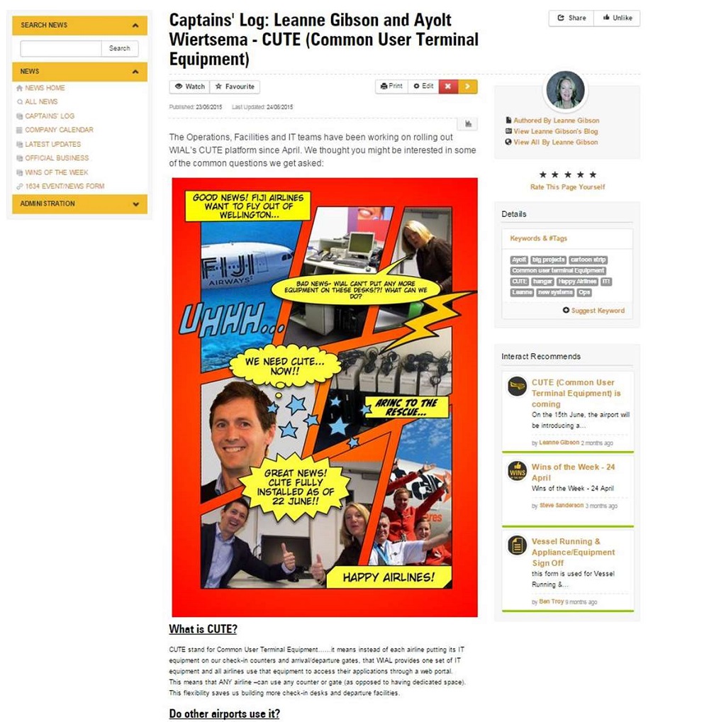
Best Use of Visuals Finalist: Wellington International Airport – 1634
How do you break the news of change in your business? Your intranet hopefully is the answer. However now you’ve started building your site, how do you make it stand out? Leanne Gibson at Wellington International Airport has nailed it.
Best Use of Visuals Finalist: Dex Media – The Buzz
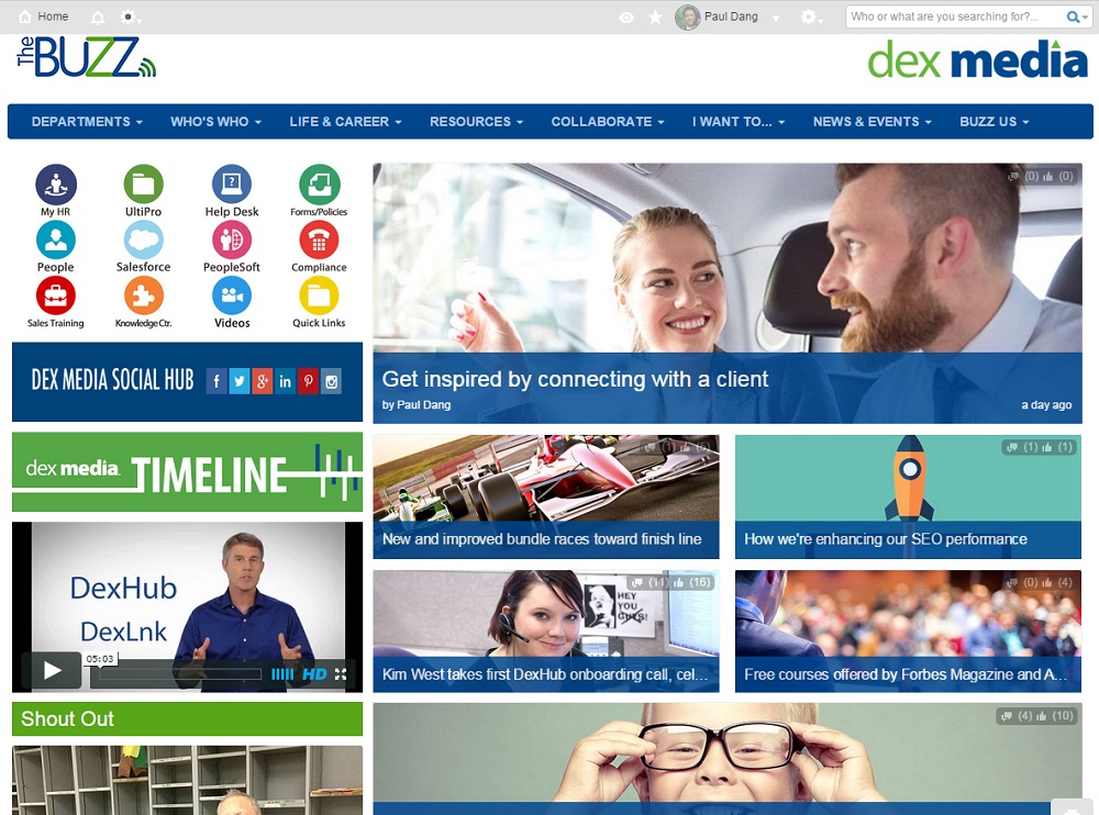
Paul Dang and his team have produced a superb intranet at Dex Media. They used it as the vehicle for a merger between organisations and empower employees to discuss what they are working on and to share more.
Intranet Design Guide
You only need to get a sneak preview of their homepage to imagine how good the user experience is.
Paul will be guest blogging later this week to share their internal comms success story. Make sure you subscribe to our blogs at the top of this page so you don’t miss out.
Best Intranet Use for HR Finalist: ASPCA
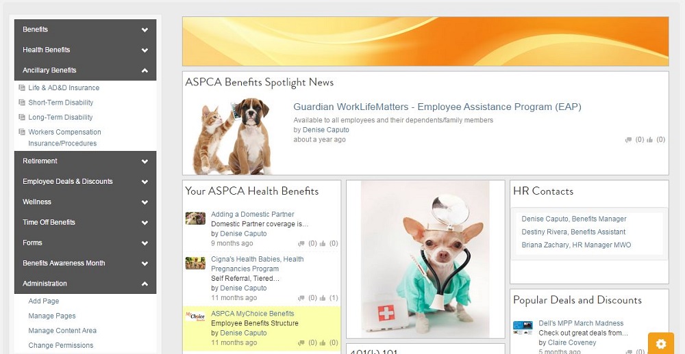
Engaging and effectively collaborating with volunteers is a common mission for a lot of charities. ASPCA has attacked this from a number of ways, from enabling volunteers to create teams of interest to simplifying the dreaded annual insurance submission via their site. Lindsey Callahan and her team have produced a great experience which makes the user journey enjoyable and ensures HR objectives are met on the way.
Best Design Finalist: Oxford Innovation – Voice
We were treated to some incredible designs at the Interact Intranet Awards 2015 and Oxford Innovation and Canterbury City Council sparked a tidal wave of intranet envy. Canterbury City Council won on the night but like all good (friendly) rivalries, they have been matched together again for Round two.
Intranet Design Guide
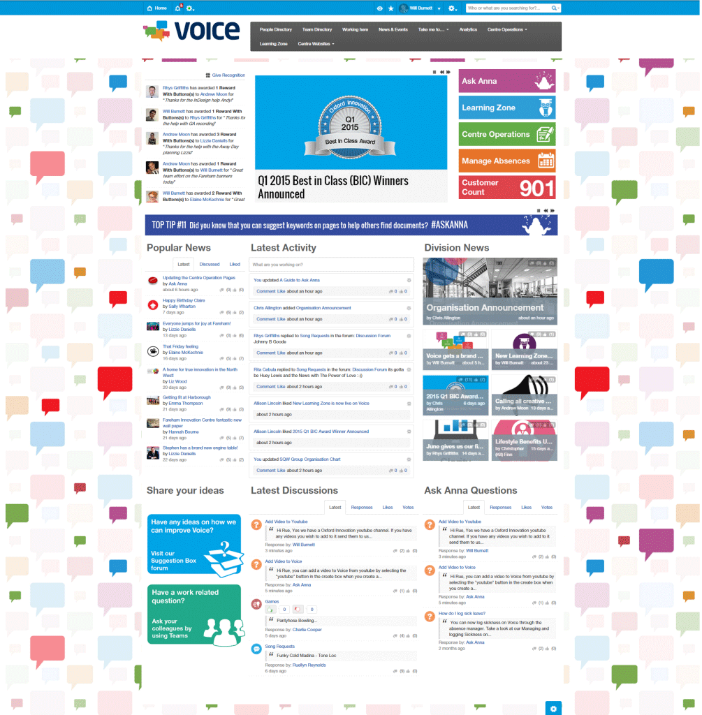
When you look at Will Burnett’s Voice, you can see why the judges were wowed by it. From an instantly engaging homepage through to excellent Content Areas, Content and Teams, Voice is an amazing intranet example.
You can explore more of Voice in Laura Soper’s blog.
Best Design Finalist: Canterbury City Council – iCAN
In the white corner (well David Newell is a Leeds United FC fan!) is Canterbury City Council. With their lead character Dot, the site is bright, exciting and allows them to communicate a more open culture often desired by local government sites.
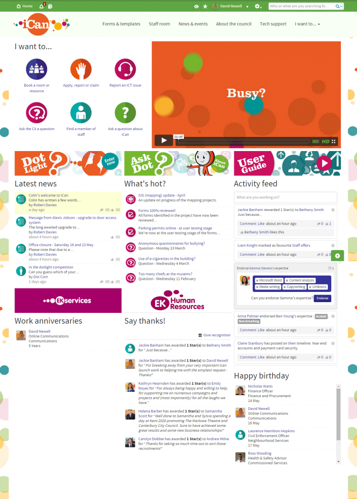
Look out for David’s blog next week as he will be sharing all the great stuff they’ve been doing.
Finally, the big one. Can Matt Phillipson of Sport England repeat his success in the 2015 Interact Essential Intranet Award against the likes of industry giants IBM and Citrix?
Grand Prize, Best Overall Intranet: Sport England – Inside Track
How do you begin to achieve 92% user-generated content across your site? By turning a Mini into a Porsche of course!
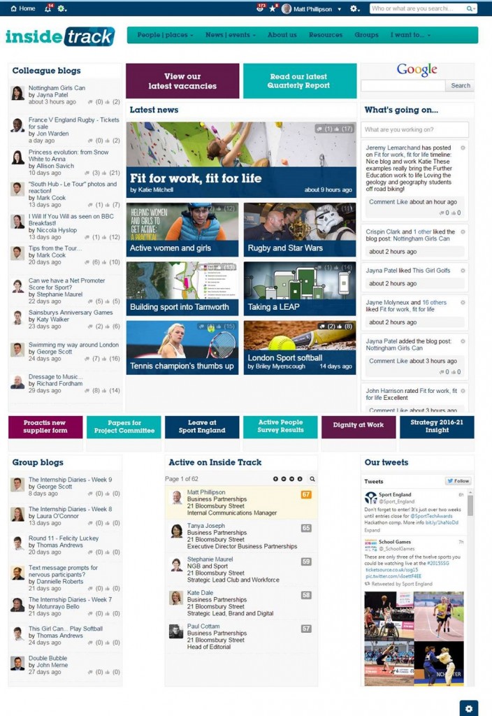
Meanwhile their author guidance has resulted in loved content being produced across the organisation.
