Who are Oxford Innovation?
Oxford Innovation provides serviced office space and business support across 21 locations around the UK. Each centre is individually managed with its own personality and branding.
Our productivity challenges
With the workforce spread across the country within individual centres, we found that staff barely knew each other. They would keep to their teams in their specific locations, not really interacting or communicating. Amongst other things this meant good ideas weren’t shared openly and issues weren’t discussed; a number of problems were parroted up the ladder to senior members of staff.
So we launched an intranet, Voice, with the objective to tackle the lack of communication, problem solving, innovation and collaboration. Not much to ask! You can read more about how we tackled these challenges through Voice on a previous blog, but for now I want to share our tale of design (it seems only fitting as a named finalist in the Ragan 2015 Intranet Awards for Best Design)…
1) Make your intranet homepage engaging
Our homepage layout is designed to be easily digestible upon arrival, with more information appearing the more you scroll down.
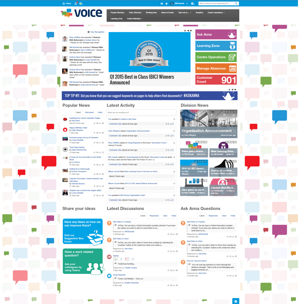
Voice homepage
We originally had an intranet homepage which showed everything anyone could possibly need to know and it was all in list form. Whilst I thought it was great and covered all the boxes, user feedback revealed it was too busy and lacked the need to explore Voice – you could quite comfortably camp on the homepage – so people just didn’t.
2) Make your intranet site consistent and relevant
Our values matched up with the challenges we aimed to overcome by using Voice so we wanted the branding of Voice to coincide with the company values, replicating them in the design.
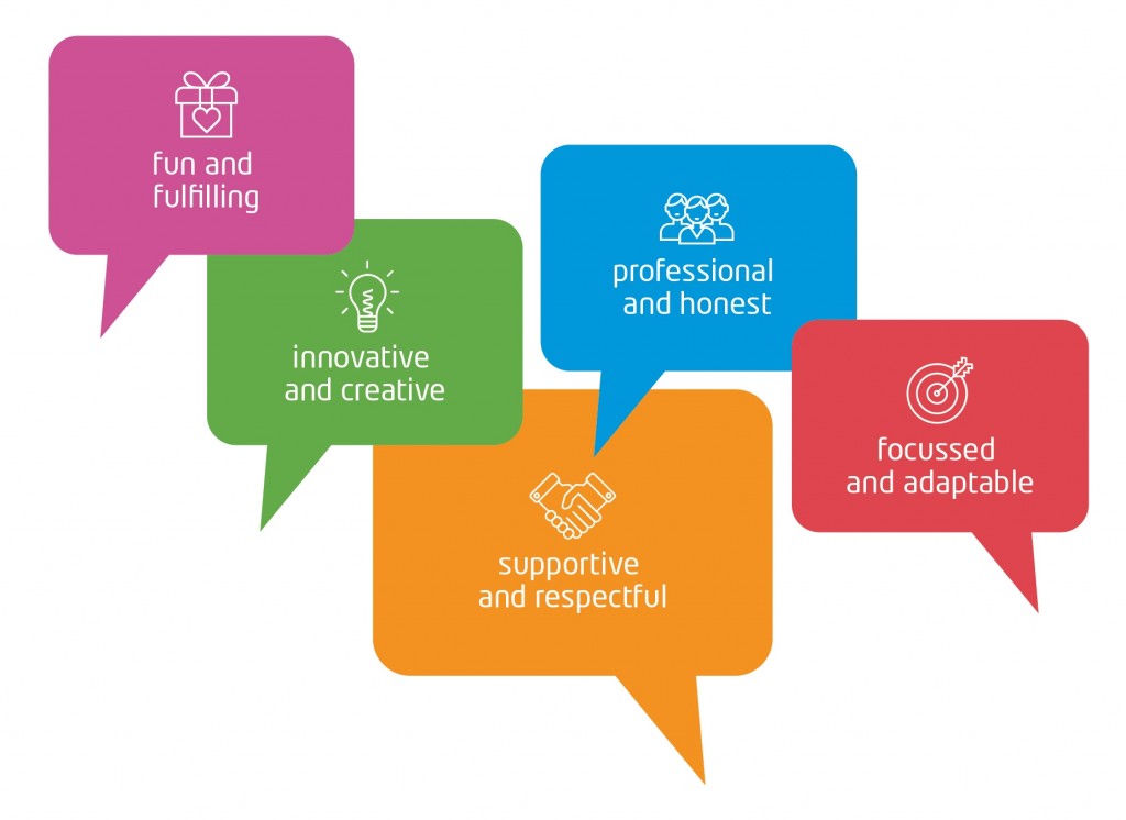
Oxford Innovation values
3) Make your layout simple
We were keen to keep a very clean and simple intranet layout throughout Voice to enable people to find what they needed fast. It was important to reflect our values and get the balance right between being fun and supportive, whilst remaining professional.
Simple iconography is used throughout Voice to navigate employees to the information they need around the site. We were determined not to fall into the comfort zone of providing all the data all the time, but break it up and focus on the user-experience, asking staff what they want to see and change the design accordingly.
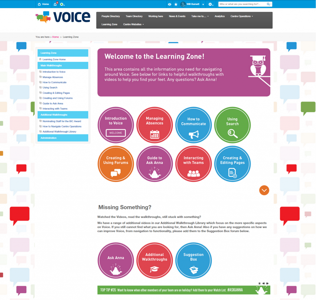
This is our Learning Zone content area which uses simple iconography to direct users to where they need to go
We are slowly adding more and more procedures and documents to Voice as it’s streamlined layout is encouraging other departments to add more content.
Our design of the pages within the content areas follow this simple layout; main multimedia at the top, with additional information attached or below; to make the user experience that much easier and more engaging.
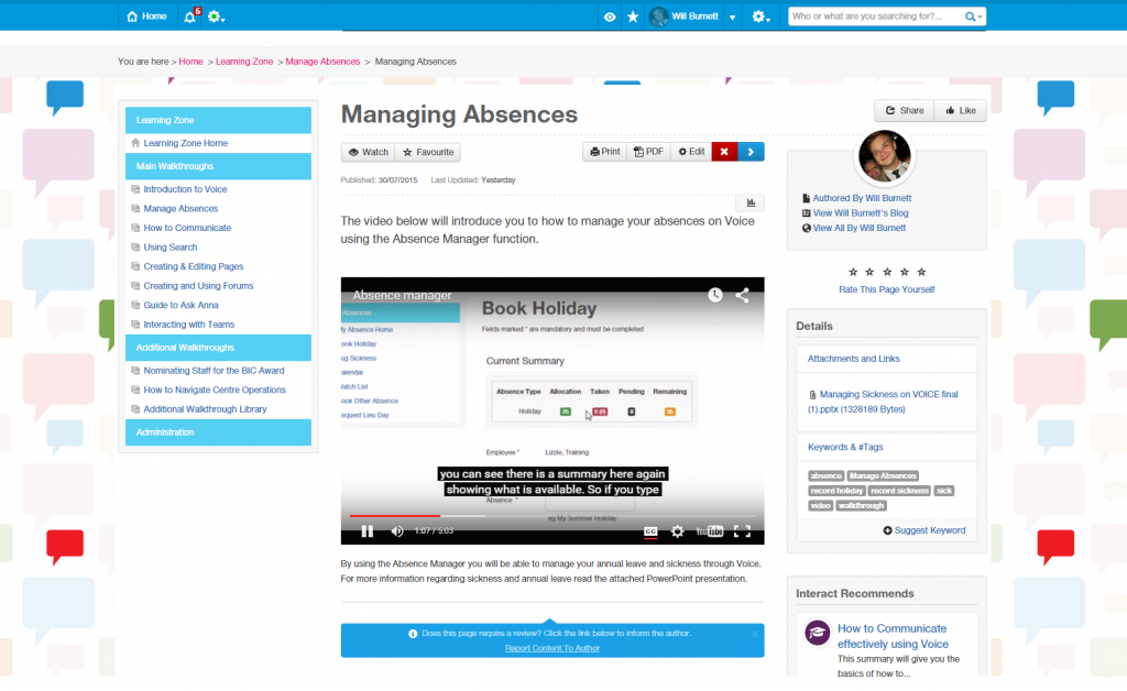
As with the format of all our pages, this example shows a video at the top of the page to explain how users manage absence
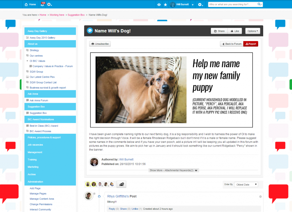
Our forums also follow the same format, whether work related or a bit more fun, users know what to expect when they view a thread
4) Make your intranet useful

Our mascot, guru and Voice leader – Ask Anna
Our intranet guru, Ask Anna, is integral to Voice. She can be found answering questions in forums, commenting on discussions and generally helping out.
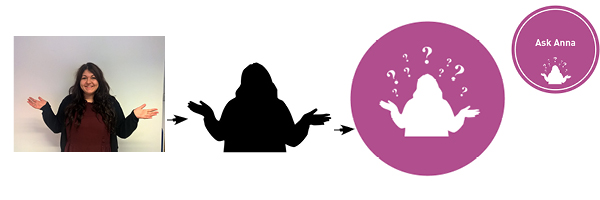
The design of our intranet mascot
Ask Anna was inspired by our Marketing Assistant, Anna, who used to answer the majority of Voice questions and help staff over the phone. We decided “NO MORE” and created an all-seeing, all-knowing intranet guru there to help us help staff throughout Voice.
How can employees find Ask Anna?
Ask Anna is found in her forums and across Voice. She regularly shares and posts comments using the #toptip hashtag, which are sent out periodically through the activity feed. If we see that someone has made a small error, we will gently remind them of better ways to do things in the future using this method. Also if any questions are asked regarding Voice, Ask Anna regularly comments with the answer.
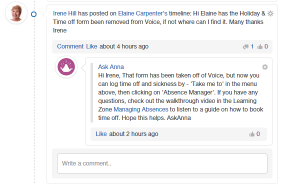
Banners are used to break up pages containing #ASKANNA top tips. These tips are rotated on a tick-a-tape and provide a constant stream of helpful tips whilst helping to structure the page. They follow the same brand voice guidelines as the background and homepage.


5) Make your intranet theirs
We allow staff to manage their own team areas and be as creative as they wish with the design and layout. We will review each one and make suggestions based on what they have come up with. This has suited us well so far; formal project teams have standard, professional layouts, whilst more fun teams have much more informal layouts.
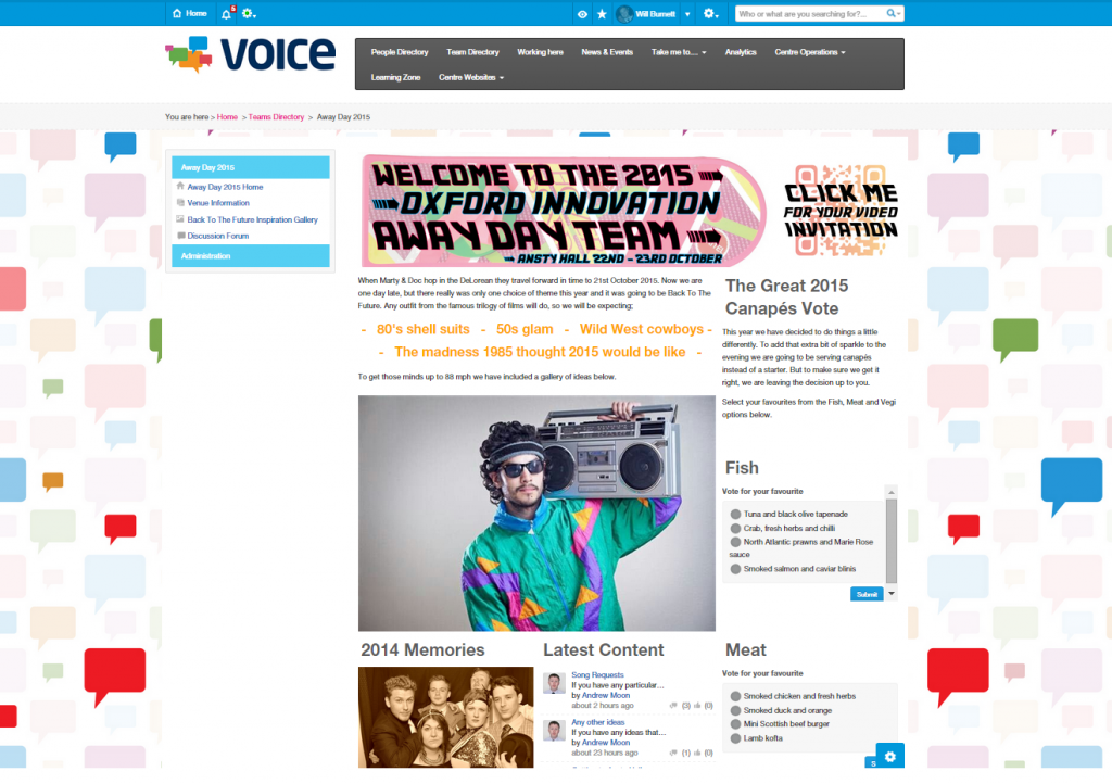
Each team manage their own team area. This particular page is about the Back to the Future themed team away day
The future of our intranet design
As we are always looking to improve the user experience, Voice is constantly adapting and evolving. Our employees help shape the design and content. We have had Voice for over a year now and it grows daily in strength and influence, something which we hope is recognised in the Ragan awards next month.
“Look on Voice” is a common phase used around the office, everyone feels closer together because of it and productivity has increased. Problems are put to discussion, ideas are shared and solutions found. Voice has provided us with a completely new way of thinking.
