Does your intranet provide a user experience that engages employees and helps them find what they need? Follow these intranet UX writing best practices to give every user the best possible experience.
When it comes to intranet user experience (UX), organizations typically focus on aesthetics, content, and navigation. However, another important aspect of UX is often overlooked: writing. The written word plays an essential role in the UX of your company’s intranet.
Those of us who manage and maintain our organizations’ intranets day-to-day are not necessarily experts in design or UX, but we are communications professionals, which means we understand the power of the written word. Yet, without strong knowledge of UX writing, we can all be susceptible to blind spots in how we should use words to enhance the intranet experience for our co-workers.
Get inspired by best-in-class intranet designs, guaranteed to engage your employees
Let’s take a moment to understand the meaning and definition of UX – and its purpose within an intranet – before we explore some intranet UX writing best practices.
What is UX?
User experience (UX) refers to a person’s emotions and attitudes about using a particular product, system, or service. It includes the practical, experiential, and emotional aspects of a person’s interaction with a digital user interface (UI), such as a corporate website or a company’s intranet software.
Essentially, UX is about how easy or difficult people find it to interact with technology. If someone can load up a UI and find information or complete a task quickly, that’s an example of good UX. If they don’t understand the navigation or digital signposts, and can’t accomplish their goals, that’s an example of bad UX.
As UX is built cumulatively from all aspects of a UI – from a website’s menu to the use of images or videos – there are a wide variety of elements that shape outcomes and attitudes. UX writing is just one of these elements, but a very important one. The “microcopy” words used on menus, broken page links, or on the buttons directing people from one page to another are all critical (though often small) aspects of UX writing.
Whether a company chooses to write “BUY NOW” or “Let’s get started!” on a website button, for example, may fundamentally change the experience a user has of that UI and the brand more generally.
Why is intranet UX important?
In today’s digital workplaces, good intranet UX is an essential aspect of the digital employee experience (DEX). If you want employees to keep coming back to your intranet and engaging with its content, you need to make sure their experience is as smooth, intuitive, and enjoyable as possible.
This is especially true when it comes to the written content on your intranet’s UI, whether it’s the text that appears on menus, buttons, or other elements.
To ensure that users can easily find the information they need and navigate your intranet effectively, it’s important to follow intranet UX writing best practices.
Get inspired by best-in-class intranet designs, guaranteed to engage your employees
Best practices for intranet UX writing
Some of the key things to keep in mind when writing for your intranet UX include:
1. Use clear and concise language
An intranet that is easy to navigate should reduce the cognitive load for every user. This means avoiding language that is lengthy, clunky, or complicated. More complex language takes people longer to process and can be a hurdle to finding the information they need.

Concise writing is focused and to the point. It eliminates unnecessary words and is usually the result of rigorous editing. When you’re editing, look for ways to make every sentence shorter and clearer. On a second or third read-through, you may notice words that add little value and make your writing feel cluttered.
You can also make UX writing easier to process by avoiding jargon and technical terms. Research has revealed that 80% of people prefer to read simple language over jargon, even when the jargon relates to their own specialism. In short, plain and simple language works best when it comes to UX.
2. Write in a user-friendly tone
The language you use on your intranet will shape the personality and feel of your brand, so take time to consider its tone of voice.
Are you looking for a more corporate and serious tone or striving to inject more fun and personality into your intranet? This may be as simple as having ‘Take me there’ versus ‘Find
out more’ as your call-to-action buttons.
Consider how you want to come across to your employees, and whether a tone that injects humor and is more casual might be more appealing to your audience, or one that is more corporate, formal, and matter-of-fact.
It may even be worth speaking with the different teams in your organization to understand if there are very specific terms that need to be included. It’s probably a mistake to point staff to a “scheduling” feature if “rota” is a more common term.
Get inspired by best-in-class intranet designs, guaranteed to engage your employees
3. Be consistent
Using inconsistent language across your intranet can create confusion, yet this can be a common issue in UX writing. For example, you might use “booking” to describe arranging something on one part of your intranet software, but you might use the word “scheduling” for the same purpose on another part of the intranet.
Using consistent language across every area of your intranet is essential for helping users to accomplish their goals with as little additional thought processing as possible.
4. Break up lengthy text
Want to know a secret? When people read a website, they often don’t read it. Every UI contains so much information that we are predisposed to scanning and searching for directional signposts. As readers, we seek out the verbal and visual cues that take up where we want to go. This can work in your advantage, however, because it means an even greater role for headings, FAQs, information “accordions” and other page elements that might recur in addition to body text on a webpage.
Breaking up large chunks of text into shorter sentences and paragraphs, and defining what information each section contains with headings and subheadings will help your co-workers find the information you want them to know when they’re scanning. Visual elements such as images and graphics are also useful for breaking up text and highlighting key information.
Interact’s intelligent Block Editor is an intranet CMS that allows authors to achieve better UX signposting through simple drag-and-drop functionality. Adding a variety of text blocks, column blocks, image blocks, and video blocks breaks up each page and makes it easier to scan.
5. Organize information logically
This is especially important when thinking about your navigation menus and homepage content. To help ensure your intranet UX presents information in a logical way, ask yourself these questions:
- If a user came to your intranet for the first time, how would they find their way around?
- Where might users go first when looking for the information they need?
- What information would users want to know first?
Answering these questions will help you refine and organize the content you need on your intranet. If you need more input then holding focus groups with employees from across the business can also help to ensure your intranet, its content, and your UX writing are all hitting the mark.
6. Consider accessibility and inclusivity
Raising the importance of accessibility in UX can distinguish the truly excellent examples of UX writing. Great UX is not only about being visually accessible, but also ensuring that your choice of words is inclusive for your entire audience through accessible communication. This may range from considering how language needs to be inclusive along grounds of race, gender, or neurodiversity. Ask yourself whether there may be areas in your UX writing that are unintentionally alienating people within your organization.
To make sure everybody feels included, it’s important to use terminology that is universally accepted and resonates with diverse groups of employees. We know from speaking with companies in all industries that gaining internal buy-in and engagement is easier when language reflects everyone’s lived experience and personal preferences.
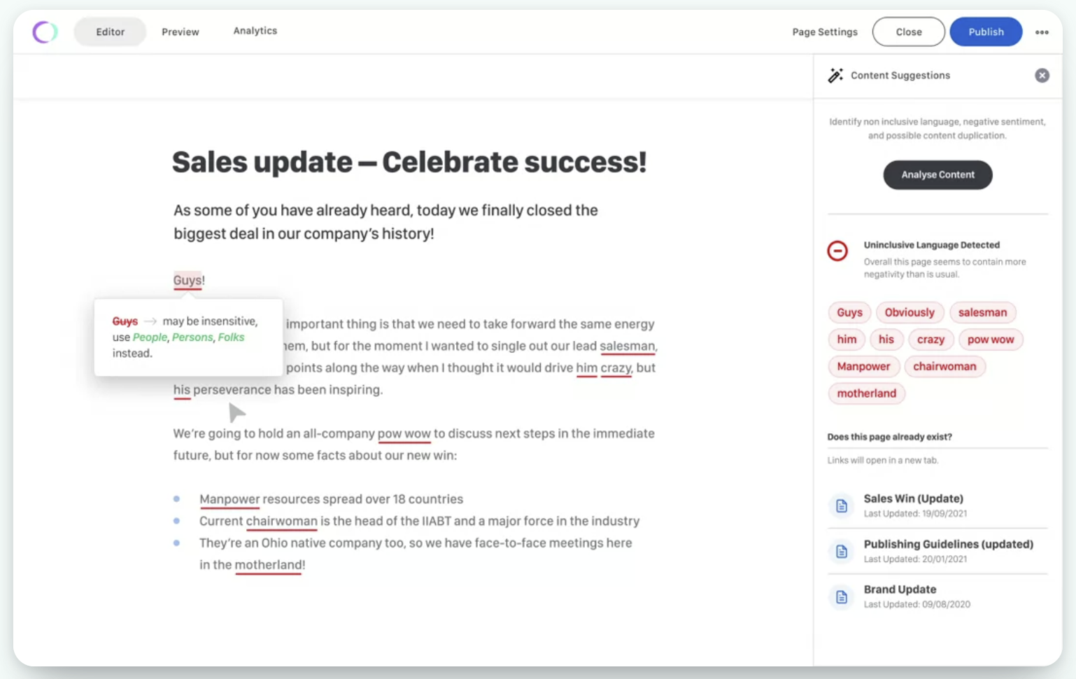
Interact features a built-in inclusive language editor, which can identify potentially non-inclusive language and make it easier to create content that speaks to all users.

Create an intranet experience employees will love
For your intranet to truly win over your employees, you have to consider UX. This means not only considering intranet design and navigation, but also the content and written words that help guide your co-workers through the platform. By following these best intranet platform principles and practices for UX writing, you can give users an experience they enjoy.


