How to break down barriers by reorganising your intranet
Organising content on your intranet is one of the most important elements for success. Ensuring users can navigate and search your site intuitively and easily is crucial to making your intranet a useful and useable business tool.
Easy navigation is crucial in intranet design because navigation and page layout make people aware that information exists and help them to find what they need. Content must be organized such that the categories, hierarchy, and terms make sense to people.

Why intranets were structured departmentally
The first intranets back in the early and mid-1990s were most likely structured departmentally; the company’s organisation chart was at the core. The management of the intranet was most likely in the hands of the IT team (largely due to the complexity involved in installing and updating the site), rather than someone specializing in intranet or communications. Matching the intranet structure to the organisation’s structure was therefore the easiest approach.
What’s the problem?
Organising intranet content by department tells the user “you belong in your section and not in others” ? When each department has its own section on the intranet, the content contained is often for the team themselves, not for the other users. ? In this scenario users are much less likely to visit other departments’ sections, purely because little there is relevant or useful to them? It then becomes quite challenging for departments to get their messages (often important) read by the majority of staff, because they are contained in a section few are visiting (outside their own team members).
Naturally, a number of situations can and often do occur:
- Staff do not use the intranet but email/call/approach the team for the answer they need, thus defeating the basic object of having an intranet
- Staff complain of not knowing what’s going on in the organisation (despite the fact the intranet may contain this information).
- Important changes to policy, procedure, organisational goals, and key personnel are missed.
- Efforts can be duplicated; “I didn’t know X was working on something similar; I’ve just wasted loads of time doing the same research she already did”.
- Format and layout in the intranet can vary widely from department to department creating a confusing, disjointed experience for users.
- The enthusiasm and ability of department intranet champions varies? Some departmental sections look nice and are regularly updated, others are neglected.
- The role of department intranet champion is assigned to person, not a role? When they leave, their expertise leave with them.
There is also the issue of new joiners? They do not have the tacit knowledge of long-serving staff regarding which department does what and they will likely find departmentally organised intranets difficult to navigate and content that may be useful hard to find.
The other concern with departmentally structured intranets is that organisation structure can and does change, often frequently? Departments may merge, disappear or be newly created? This then imposes a corresponding overhaul of your site? This is not only time consuming but necessitates a re-engagement exercise with users to re-familiarise them with the new layout and where they can now expect to find content.
Is a departmental structure ever useful?
In some circumstances, an intranet structured around the organisation chart can work. ? Very small organisations whose staff have long tenures may have a reasonable knowledge of ‘what goes where’.
If the company structure rarely changes and the users’ primary intranet activity is using information from their own department then it could be appropriate to organise things accordingly.
Even in these circumstances a departmental structure will likely impede achievement of your objectives (depending on what they are of course) ? Providing a one-stop-shop, engaging staff in what’s going on, and making common tasks easy to complete is challenging if similar types of content, as well as news and updates, are spread across multiple department sections.
If your objective is to provide an intranet in order that departments can use to better carry out their own work, in isolation, then a departmentally structured site might work? In all likelihood though, there will always be tasks, projects, initiatives, problems, and questions that involve team cross-over? No organisation buys or develops an intranet with the objective of suppressing teamwork and collaboration, but in structuring it departmentally is likely what they (unintentionally) achieve.
What’s the alternative?
The Nielsen Norman Group is a pioneer in intranet UI best practices and their user-tests from a focus group study summarised:
“Intranets are improving findability by organizing content by TASK rather than departments, using mega menus to present deep content, and using the added real estate to offer clear cues to orient users, and providing shortcuts to important pages and tools.”
In their analysis, task-based structures often better withstood organisational change than intranets organised by department. They also found that task-based navigation tends to facilitate learning more easily that departmentally organised structures? Furthermore, they found that 86% of new intranets’ information architecture was task or topic based, firmly eschewing the “old” departmental ways of thinking.

What are the benefits of a task/topic based intranet?
Task based intranet navigation targets employees with a mission: those who need to get something done whilst topic based navigation toward employees wanting to find things out? Departmental intranets do not help users find answers and they do not offer users with enough reason to visit every departmental page regularly to find out what’s going on.
Topic/task based intranets allow your organisation to create ‘communities’ of like-for-like content in a way that is user-friendly.
When considering many organisations may have broadly similar objectives, grouping content by topic and/or task will help promote:
- The intranet as a useful tool that helps staff get work done
- The intranet as place where they can easily discover what’s going on within the organisation (and perhaps the industry in which it operates)
- A sense of shared ownership and collaborative effort
- A decline of siloed working
Can you mix and match?
Yes and no? It can be worthwhile to include pages with department bios: what they are responsible for, where they’re based and key contacts and perhaps use these pages to signpost to commonly sought after documents. In doing so it is possible to provide a departmental route to some of that team’s content. ? However, trying to create a task, topic and departmental structure combined may confuse users and dilute the overall ‘purpose’ or point of your intranet.

Are there disadvantages?
A task/topic based navigation can often represent a big change to your organization and your users. You may experience challenge or misinterpretation. Whilst staff might not find the departmental structure user friendly, it is all they know and change can be hard. Engaging staff in usability testing can help overcome some of these challenges as can ‘light touch’ familiarization at launch.
What’s right?
There is no ‘magic formula’ for intranet structure and architecture; there is no ‘right way’ to organise your content? As a general rule, you should consider a structure which:
- Helps you achieve your intranet’s objectives
-What is it that you are trying to accomplish with your intranet? - Is intuitive to your users
-Can they find what they are looking for with the structure and architecture you have provided to them?
-Do they have a reasonable idea of what content is potentially available from the initial navigation options? - Will create an intranet that is used as the first point of call for information
-Otherwise, what is the point? ? If users side-step the intranet and rely on tried and tested ways to source information, rather than ‘wade through’ your site it’s pretty pointless having it. - Fits the needs of users and your organisation
-Depending on the structure and locations of users, some may need to access parts of the intranet others do not.
Your intranet objectives and in turn, your site’s structure begin and end with user requirements and feedback. So if you have a departmental structure on your current site and your user research gives you quotes like:
- “I don’t know where to go to find this.”
- “I know the information is there but finding it is difficult”
- “I wouldn’t ever go to X department section”
- “X department’s section hasn’t been updated in months/years/ever”
- “I don’t know who does that.”
- “I’d probably go and ask someone.”
And your analytics tell you than few users go beyond the homepage then your structure is not working for your users and you should consider changing it.
User testing plays an important part in deciding on and then protecting structural concepts. ? Testing your structure gives you valuable information about user behaviour and acceptance? The governance team have a duty to take user testing results into account when making final decisions about site structure; not to ignore them in favour of their own desires and views.
Some quotes from customers:
These customers had intranets structured around their org chart and moved to a non-departmental layout.
Royal College of Nursing

“Our old intranet was structured around the departments and I hadn’t realised what a blockage this was for organisational efficiency until we changed it! Staff were having to go to two or three different parts of the intranet to complete one task, i.e.: I want to work from home, so I have to go to the HR section for the policy, the H&S section for the risk assessment for my home office, and then the IT section to request the equipment/access. The structure was really slowing everyone down. Now we have a ‘home and lone working’ section where staff can find everything they need. What I hadn’t anticipated was that by grouping content like this, we’d be more able to highlight what was available to staff. No-one goes to look in the ‘HR’ section unless they know what they’re looking for, now staff see we have sections called ‘benefits’ ‘staff news’ ‘working with members’ etc, they connect with titles on a more personal level and go looking to see what’s available to them. On the other side of all this, it’s encouraging staff to recognise where their work might overlap with other peoples and so I’m really hopeful this will help to start to break down some of our silos too.”
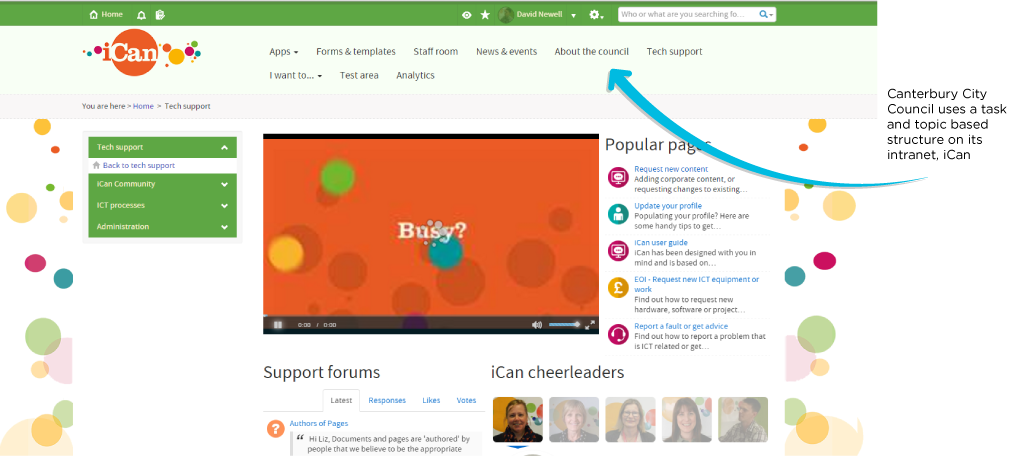
Canterbury City Council

“We opted to structure the intranet around tasks rather than internal structures for many reasons, but mainly because internal restructures (from experience) can be really messy and are rarely as simple as departments changing names. Departments often merge or even disappear which would mean a lot of work moving forward? We also have many tasks that could potentially fall into a number of service areas which would make departmental structures challenging, for example, a digital tender document could be finance, procurement, legal, digital.
“It can take a long time to learn the internal structure of our organisation meaning that new starters would have no hope in finding what they need in a departmental structure and would be less productive and resort to asking colleagues/managers.”
How is your intranet structure working for you? ? Either departmental or not? I’d love to hear from both sides of the coin!
